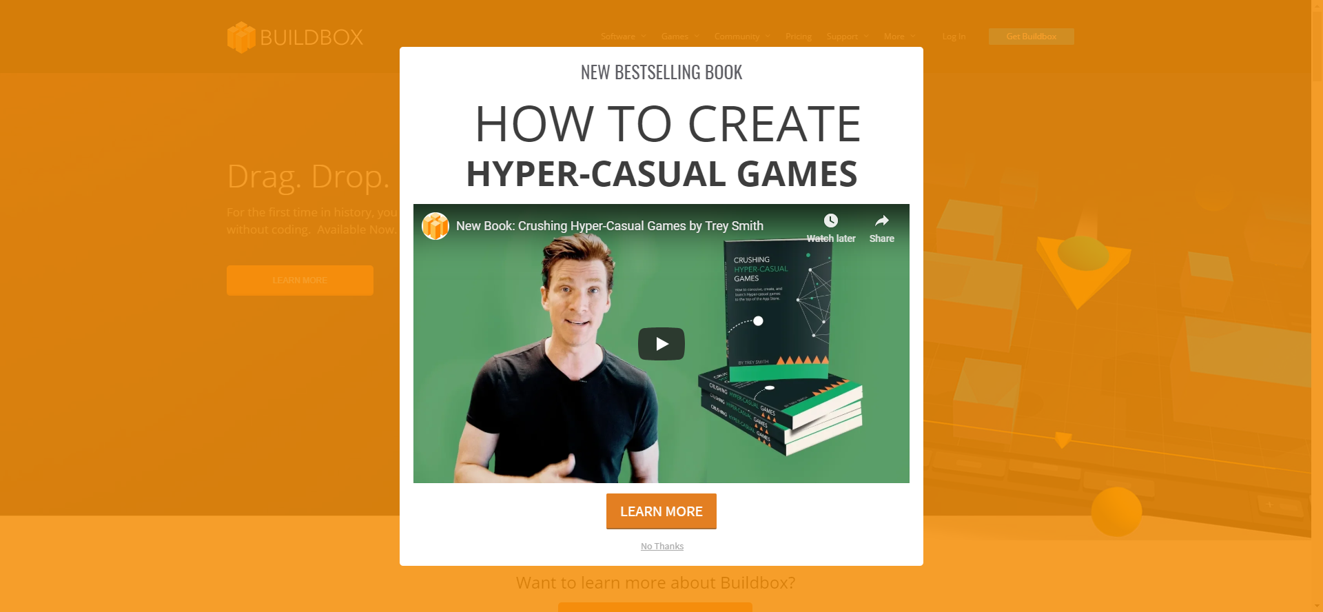
CONGRATULATIONS! You are the 1000th reader of this post → click here to claim your prize!
While modern, pop-up blockers protect us from those kinds of messages nowadays, in the earlier days of the World Wide Web, an average internet user was a “lucky winner” almost every day.
When I think about it now, this is probably one of the reasons why people started feeling animosity towards flashy pop-ups. All of those irrelevant fake offers that were in the way of the content we were trying to get to are the prime suspect for why some marketers today are hesitant to use them in their marketing campaigns.
That and, well, this:
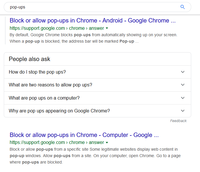
If you Google “pop-ups”, you are not going to get an Ultimate Guide for Creating Pop-ups at the top of search results. You are getting tips on how to block pop-ups and advice on why you should or shouldn’t allow them.
While this presents pop-ups in a bad light, you should still not be scared to use them. Because if you look at the numbers, with an average conversion rate of over 3%, pop-ups still work, and that is the only argument they need to prove they are not obsolete.
However, we can’t ignore the fact that pop-ups can be annoying for the user. The trick is knowing which type of pop-up to use, in what context, and at what time.
Let’s try to find some answers by looking at four different pop-ups you should implement at your website.
If you stick with me until the end, as a bonus, I will throw in some common mistakes you really need to avoid if you want to generate leads with pop-ups while still preserving smooth user experience; it is because I like you guys.

How Many Types of Pop-ups Are There?
Before we get down and dirty, let’s briefly discuss pop-up types. There are a few different pop-up classifications out there, and most are based on the following characteristics:
-
When they appear - Immediately on page load after you spend X seconds on the page when you try to leave or after you scroll to a certain part of the page after you click on something.
-
How they appear - Slide-in at the side of the screen, sit at the top or the bottom of the screen, pop-up in the middle of the screen, or taking your full screen.
-
What kind of content they offer - Normal or interactive.
We are not here to debate semantics and naming conventions. The one thing that is important to know for the rest of the article is that we are going to mix and match different characteristics to find pop-up types that can play an important role in your weapon arsenal.
4 Types of Pop-ups That Still Work
Keep in mind that the pop-ups we are going to mention here are not the only ones you should consider implementing at your site; they are just the ones that often perform the best and carry a minimal amount of risk.
1) Exit-intent Pop-ups
The first on the list, to no one's surprise, is the exit-intent pop-up.
One of my all-time favorite exit-intent pop-ups was something Chanty used a year back (not sure if they use it anymore). I couldn’t find the original, so here is the snapshot of that pop-up that was used in this infographic from Visme, which also features many useful tips on what you should watch out for when designing exit-intent pop-up.
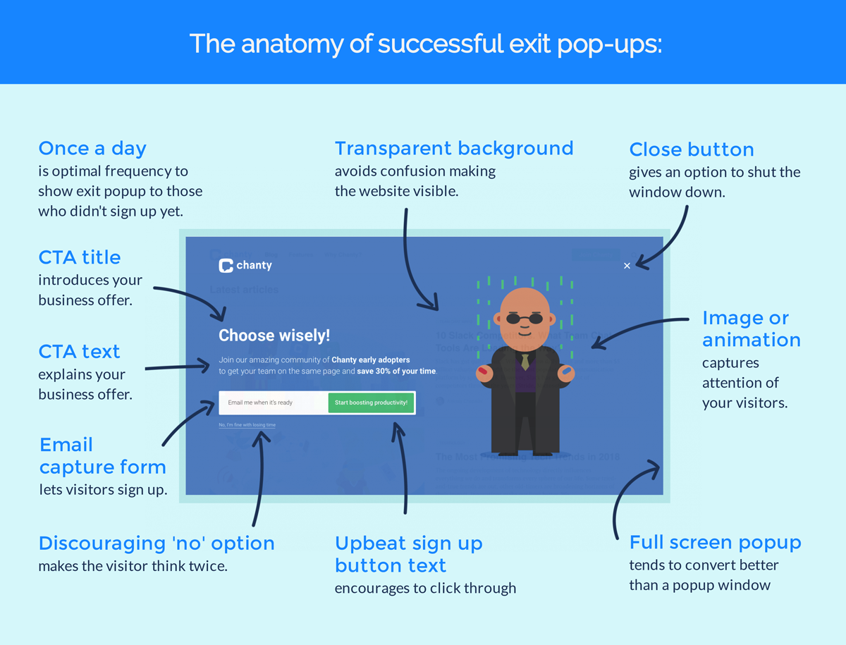
While the above example shows what I like to call “full screen” pop-up if the message is simple and you have no graphics you want to use, a standard box with a blurred background can still get the job done. Here are two great examples from Limble CMMS and Optinmonster.
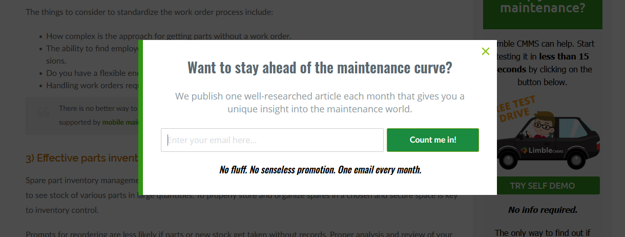
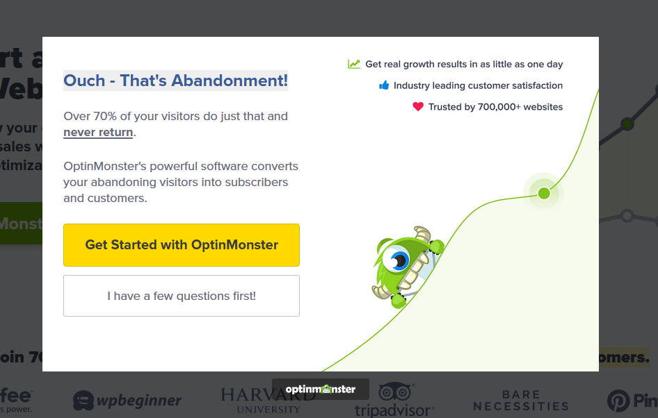
While exit-intent pop-up can be used for any kind of offer, from personal experience, I would recommend using it less for standard content offers (like e-books and checklists) and using it more for newsletter sign-ups, discount codes, free trials and other “stronger” offers that have enough weight to engage someone who is on their way out.
Why Do They Work?
Another plus is that they help you catch people that are kind of interested in what you have to say and/or offer but not ready to make a big commitment just yet. What this essentially does is give them a reason to stay engaged with your brand.
It is like when you are out with your friends, and you are not sure if you should order another drink, or it is time to leave. If you say to your friends that you should probably leave and they just say “Sure, see ya next week,” you are probably going to leave. But if someone is coming to the table with another drink for you and asking you to hang around a bit more, there is a good chance you will stay.
And this is what exit-intent pop-up is great for.
2) Click-activated Pop-ups
If you are really concerned about being intrusive or annoying, you can look to implement more click-activated pop-ups.
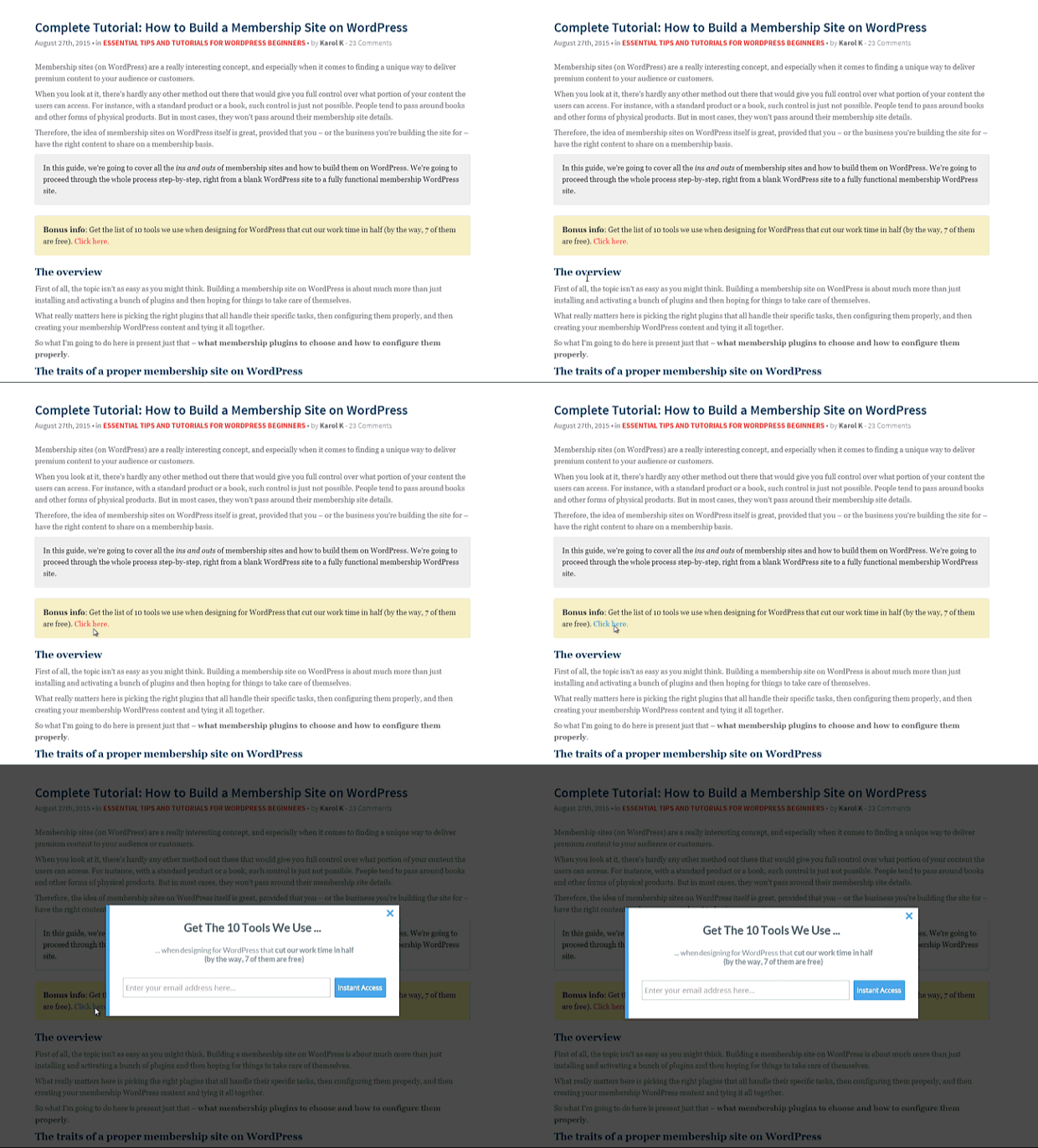
When someone says “pop-up,” our mind immediately flies to lead magnets. However, pop-us can have another, more “practical” purpose. And you surely have encountered it before.
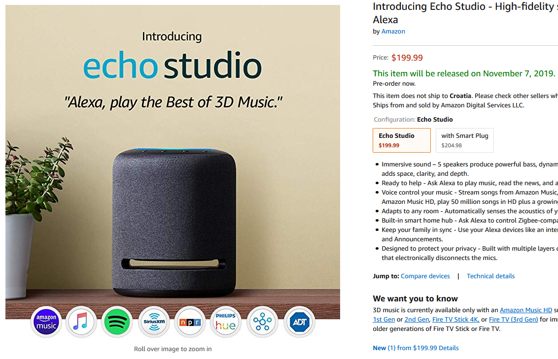
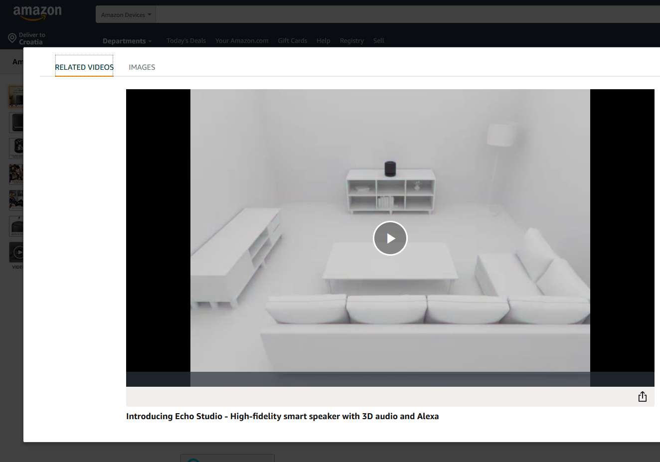
A lot of eCommerce stores use click-activated pop-ups to showcase their product, be it through an image slider or a video. You can see that implemented on many products on Amazon, where if you click on the product image on the left...
...a pop-up containing a product video shows up:
If you are using WordPress, there are many plug-ins that can help you create click-activated pop-ups.
Why Do They Work?
Click-activated pop-ups usually have a good conversion rate because of the pre-expressed interest in your offer. In translation, if someone clicks on a link or an image that activated the pop-up, that action itself means that they are interested in what you have to offer.
You can’t get that kind of pre-approval with pop-ups that load on any other type of trigger.
Of course, this only works in the context of your lead magnet offer being relevant to the thing the visitor has clicked on. If the anchor text and the surrounding paragraph have no connection to the offer/information that loads, your conversion rate will suffer greatly.
3) Opt-in Bars
Who doesn’t love opt-in bars? They are flexible and hard to miss, but still fairly subtle.
Here you can see how The Daily Egg uses them for a newsletter subscription at the top of their blog homepage.

Here is an example from Optimizely using the opt-in bar at the bottom of one of their pages.
And here is an example of a floating bar implemented using Optinmonster.
Why Do They Work?
When implemented correctly, opt-in bars can drive a lot of attention to your offers without hurting the overall user experience. As such, most marketers use them as floating bars — make them stick to the top or the bottom of the screen as you scroll through the content.
This type of pop-ups can be used for many different purposes, but it is really convenient for:
-
Newsletter sign-ups.
-
User agreements, GDPR statements, and similar information you need to make visible to a new website visitor.
-
Active contests, webinar sign-ups, and similar ongoing offers (especially if you are using a countdown timer as the floating bar can keep that timer in focus the whole time, increasing the sense of urgency).
That being said, you still have to use them responsibly. If you make the bar too thick, it will negatively affect user experience. If you allow it to load on devices with smaller screen size, it could also cause UX issues — especially if the “close” button is hard to see.
This is why this type of pop-up often isn’t suitable to use in conjunction with lead magnets and offers you need to “sell” by using long copies and a lot of social proof. If one line of copy plus a button is not enough space for a specific offer you want to make, consider using another type of pop-up for that offer.
4) Interactive Pop-ups
For the last thing on this list, I wanted to throw you a curveball and talk about interactive pop-ups.
While every pop-up is in some way an interactive element as people need to click somewhere to close it or enter their contact information to accept it, interactive pop-ups are something that takes the interaction one step further.
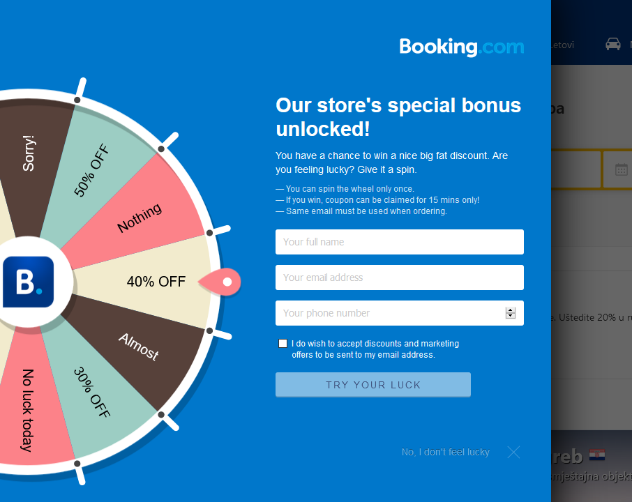
At the moment, there isn’t much variety when it comes to interactive pop-ups. The most popular is definitely the “wheel of fortune” you can see in the picture below.
They work rather simple. The user can spin the virtual wheel of fortune to win one of the listed prizes. However, there are two tricks in play here:
- The “spin” happens after the user fills out the required info.
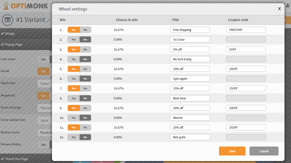
- You can adjust the percentages for different prizes, from 0 to 100 percent, to massively manipulate the results.
The picture below shows how you can adjust the percentages when creating lucky wheels in Optimonk.
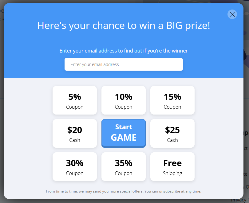
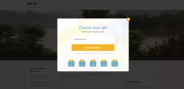
The other ones I came across may look a little different, but they are based on the same exact principle of a randomized reward.
As one alternative, you could argue that pop-ups with videos are a type of interactive pop-ups, but some would say that it is a stretch.
Why Do They Work?
They are fairly new and exciting, and people like to try out new things, especially when they are blasted with the same type of stuff all the time.
Then there is the factor of gamification. I am sure that the readers from the casino industry will agree that people like to take gambles, even when they are aware that the chances of winning anything substantial are slim.
With the ability to control the percentages, you can create really enticing offers. It is up to you to decide how generous you want to be.
A Big No-No’s When Using Pop-ups
You don’t want to alienate website visitors with your pop-ups? Then make sure you are not repeating the following mistakes.
1) You Are Using Way Too Many Pop-ups

It is not that hard to decide how many pop-ups are too much. For example, if you are asking yourself, should you add one more — you probably shouldn’t.
Now, that is not to say that you can’t have more than one pop-up. To help you make the right decision, ask yourself the following questions:
-
How long is the page? If you have 5k word ultimate guide, having multiple pop-ups is allowed, and often even expected. On a mere 700 word post, having more than one is pushing it.
-
Which types of pop-ups are you using? On-click pop-ups or small slide-ins that do not block or lock the text are easier to digest than most other types of pop-ups. If you have to use more, keep in mind that the flashier the offer, the more chance it has to annoy the visitor.
-
Which pages are we talking about? For instance, if we are talking about your money pages, it might be a good idea to refrain from using pop-ups at all. Your money pages should already be optimized around the CTA you want the visitor to focus on, so anything else will just be a distraction. In this case, an exit-intent pop-up seems like the most reasonable approach - if you really want to use one.
2) Your Offers are Completely Irrelevant
Do you know what annoys the bejesus out of people? Spamming them with irrelevant things they do not need.
Let me clarify. Let’s say you have a step-by-step guide. You decide to dissect the most important step into a checklist and offer it as a lead magnet. People that find it useful will opt-in; others will just skip it with no hard feelings about it.
However, if you had a pop-up offering something completely irrelevant to the post, people will start to ask, “Why am I seeing this?”. And there is a very short train of thought between that and “Why are you spamming me with this nonsense?"
Knowing that, if you still want to push a really important offer on pages that are not especially relevant, there is a way to do that, but you have to be creative. The trick is in building an artificial connection.
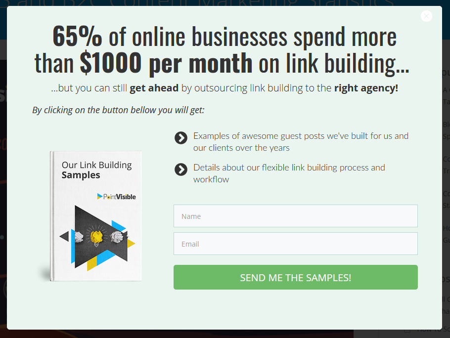
Here is an example of how we push our “link-building samples” lead magnet on posts that have nothing to do with link building:
- On an infographic that discusses B2B and B2C content marketing statistics:
- Post that reviews blogger outreach tools:
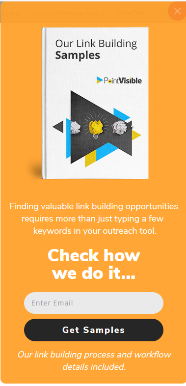
Even though the offer is a bit strong, on an unrelated post, and aims at people who are already in the bottom part of the marketing funnel, both posts still have a conversion rate between 1 and 2 percent.
As you can see, the trick lies in adjusting the copy of your offer to the content of the page it appears on.
3) You Are Asking for Too Much Information
Sometimes you need the physical address. Sometimes you need the phone number. But most of the time, a first name and a working email address are more than enough.
The more information you ask for, the less your conversion rate will be; this is confirmed from multiple different research studies done by giants like Hubspot and Unbounce.
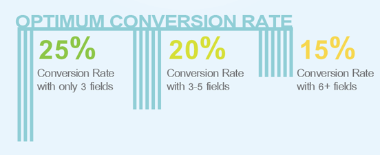
The lesson? Keep it simple and ask only for the information you need to move the prospect through the funnel.
So, the point is?
In a fight between the quality of your offer and the pop-up type in which it is presented, content wins hands down in 9 out of 10 matches.
What I am trying to say is that the quality of your offer and the relevance of the lead magnet you are offering means more than the delivery package. While certain pop-up types are more suitable for certain offers, you still need to make sure that the offer is relevant, well-designed, and has a good copy.
That is the most straightforward path for turning strangers into leads.
I hope you were able to pick up some useful tips from this post. What I am really interested to know is if any of you came across some other type of interactive pop-ups? If you did, let me know in the comments below!


