Welcome back to the next episode of our SEO Reality Show! In previous episodes, we’ve looked at multiple steps that the expert agency took to increase the Edelweiss Bakery’s website ranking potential, including the process of creating strong blog content and checking for potential technical errors.
The bakery already had an existing ecommerce section before starting to work with the agency, but it was just a small section on the main page; there were no product cards or categories. The agency knew that to increase purchase potential, there needed to be a dedicated ecommerce page with the ability to view items by category and to add product cards for each item customers could purchase.
This episode will share how the SEO agency revamped the bakery’s ecommerce features in order to increase product visibility and online purchases.
The Process
The agency wanted to start with the design first in order to determine the structure of the page they’d use, which categories would be needed, and what the overall layouts would look like.
Their first step was to create a layout for the ecommerce “Shop” section of the site, which included two additional layouts:
- Category page layout: Allows users to browse different products by type, helping them to find the exact type of baked goods they’re looking for.
- Product card page layout: Provides additional detail about an individual product

Once these layout designs were created, the agency filled in the relevant information for each product card. Let’s take a look at the exact process, step-by-step.
Step 1 — Preparing mockups and design
To create the bakery store page, the agency used WooCommerce — a standard WordPress plugin with ready-made ecommerce features and templates. To complete the setup, the agency analyzed similar elements to when they prepared the site’s overall structure:
- The bakery’s competitor websites, (selected during the early stages of the agency’s work)
- Results for common sales-driven queries, including “buy bread online” and “buy sourdough bread”
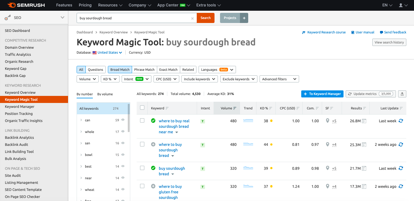
Here’s a screenshot of a competitor’s category search result for “buy sourdough bread”:

This showed the agency what competitors were doing, and what customers may be looking for.
The agency then created design mockups and sent them to a designer, following a similar process to when they helped Edelweiss update their site’s homepage design.
Step 2 — Preparing Category Pages
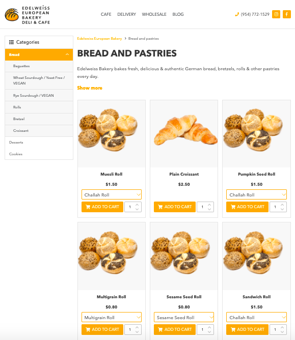
During the analysis in the previous step, the agency concluded that the following elements of the Category page were absolutely necessary:
- Product listing
- Title and SEO text
- FAQ block (*might not be necessary in every case)
- Page-by-page navigation buttons (pagination)
- Menu
- Breadcrumbs
The FAQ page may be unnecessary if you want to focus on elevating a product card page in search results over a product category page.
The agency also discovered that some categories may be too small to optimize; the Ciabatta category, for example.
This product category only contained three products, so it made more sense to try to optimize the individual product pages to rank well instead of a category page that would only feature a few items. However, the product card page could be optimized as there were at least two product cards in the top 10 results for “buy ciabatta".
Here’s the Category page layout the design team came up with.

The agency used the Keyword Magic Tool (which you can learn more about here) to prepare the technical specifications for the Category page content, and used the “Questions” feature in Semrush for the FAQ block.
Semrush recently updated their Keyword Magic Tool to show a keyword’s search intent. This is an exceptional time saver, eliminating the need for research to determine if the keyword needs commercial or informational content and eliminating guesswork.

Step 3 — Creating product cards
During the initial analysis, the agency determined that the Product Card page must include the following elements in order to best explain what different produdcts are and increase the likelihood that they’ll purchase:
- High-quality images of the product
- Product purchase/pre-order button
- Title and SEO description
- FAQ section
- Product features and description
- Brief information about payment and delivery systems
- Menu (optional)
- Breadcrumbs
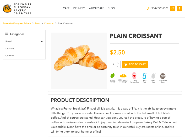
Here’s the Product Card design that the agency had created for Edelweiss bakery:

A few things to call out with this design:
- Placement and accents around certain page elements were given careful consideration. For example, the product image, price, and add-to-cart button were the brightest and most visible so that they’d stand out on the page.
- The Product Card contains all the information that would be useful to a visitor, and ultimately increase the chances that they’d purchase something. This included: product photos, reviews from real customers, and detailed product descriptions.
Step 4 — Product cart optimization
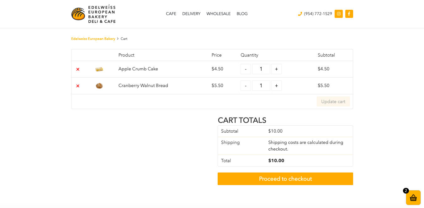
Edelweiss already had a Product Cart page, so the agency didn't create one. Even better, their cart page included the important elements that a customer is likely to want to see before checking out, including:
- what items are in their cart
- how much the items are
- the quantity of the items in their cart
Here’s Edelweiss’ Product Cart page:

While Edelweiss’s product cart page was in good working order and well-optimized already, the agency wanted to share the following recommendations to our readers who want to improve their customers’ on-site experience:
- It should include the list of products in the cart, including an image of the product
- Customers must be able to remove, add, or change the quantity of every product in it easily
- The total price displayed when placing an order must be the final price (including shipping + VAT, which at the very least must be noted that it will be calculated during checkout)
- It should allow customers to order without having to register (optional, but highly recommended)
Checkout Form
Edelweiss’s checkout process is already quick and easy, so the agency had no additional suggestions for how to improve it. Here’s what their checkout form looks like:

If you’re looking to evaluate your site’s checkout process, here are some things to consider:
- Checkout form and process should be simple and clear
- Text fields should contain instructions about what to enter
- Fields that customers need to complete should be highlighted
- Form should only ask for the information needed to complete the purchase
Step 5 — Layout and technical optimization
With the design layouts selected, the agency’s programmers were able to start setting up product listings with the templates created. The agency made the following recommendations to the programmers before they started working, which we’ll break down by category.
Setting up a product listing
The first thing that the agency looked at was how the product listings needed to be set up both on product pages and when products were being viewed by category. These are the requirements they gave the team:
- Allow purchases directly from the product listing on the category page without going to the product card. This will be a “Quick Add to Cart” button. If the customer is already familiar with the product, purchasing from the listing will be very convenient.
- The product names should be links set up via the <a href></a> tag, and the purchase buttons should be set up via <button></button>.
“This is a simple rule that helps search engines understand the page's content and elements,” the agency explained. - The menu content should be accessible even if JavaScript is disabled. The menu should be a navigational guide for both humans and search robots, and links in the menu are a local linking block.
If your menu is only in Javascript, search engines will see your store's categories as disconnected. This will result in orphan pages, which are pages with no link authority that may never be indexed. To solve this problem, create the menu using CSS so that all links are accessible when Javascript is disabled.
Canonicalization, filters, and sorting
The agency knew that it would be crucial for filters, sorting, and canonicalization to be organized in a logical way that would make it easy for users to find what they were looking for, and to keep customer traffic flowing correctly.
This is what they required:
- Configure the canonical self-reference tag (which point to the current page) for all pages without the get parameter.
- For pages with the get parameter (including product sorting and filter pages) the canonical tag should point to the main page, which is the page that had the filter applied to it.
Setting up pagination
Pagination is the sequencing of pages on your site, and the agency knew that pagination mattered both for the user experience and for indexing purposes. These were the recommendations they offered:
- The canonical self-reference tag must be configured for all pages, and the pages must be accessible for indexing.
- The meta tag for all pages (except the main page) should be formed by title — Page N mask, where N is the current page’s ordinal number in the pagination chai.
- For page-1 type (which can be formed in different ways depending on your CMS), you need to configure 301 redirects to the main page. Tthere should be no links to the page-1 type page in the pagination chain, and there shouldn’t be any self-referencing links.
Markup
Markup can go a long way in helping brands build trust, leverage social proof, and provide crucial information to their customers. The agency recommended that the developers add the following markup to product listings:
For categories and product cards, the agency recommends to create the following markup:
- Breadcrumbs micro markup
- Product markup with price (or price range)
- Product rating
This helps the page have rich snippets on Google's SERP. If there are question-answer blocks, they’ll need the FAQ Page markup.
You can get help with your markup here.
Step 6 — Filling in categories and product cards information
Once the design layouts for the Category and Product Card pages were complete, the next step for the agency was to input the information about each core product* and optimize the content.
*A single product can appear under different categories, but it should only be available through a single URL. This will prevent product duplicates while still maximizing product visibility on your site.
The agency recommends to index categories and product cards in the order that they’re completed, step by step, instead of all at once. This is to avoid having search robots crawl and index empty product pages.
Next Up
Now that the Shop page setup was complete, the agency moved to their next task! In the next episode, we’ll examine how the agency set up additional analytics for the bakery’s site to track conversions correctly and efficiently.
Infographic — 6 Steps to Create an Ecommerce Page for a Bakery

