
Do you suspect that your sales page leaves people cold? Do you think nobody’s reading your content – or, at the very least, they’re ignoring your Call to Action (CTA) buttons? Are the images on your website turning visitors off – or confusing them?
What are your visitors thinking?!?!
If you’ve posed any of these questions, or just want to know what your visitors like and don’t like, heat maps are the super simple (and crazy valuable) answer.
Copywriters and designers take note: This will change the way you do everything. Ready? I’m going to show you how to use heat maps to get the most out of your visual content. Best part? These programs are usually free or affordable (I recommend five favorites at the bottom).
What is a Heat Map? Why Should You Care?
Heat maps, aka “hover maps” and “click maps,” are incredible pieces of technology, not to mention impressive data visualizations in their own right. A good heat map program tracks the motions of a mouse – and you’ve probably noticed that as you read a page, your mouse hovers near the words you’re reading. We tend to use the curser like a finger on the page to mark where we read; but we also use it when we’re considering. Pausing mid-thought to decide the age-old question: To click? Or not to click.
By tracking the mouse’s movements, you can see what attracts your visitors’ eyes, what options they’re considering, and what might be confusing them. You’ll also see, very clearly, where your page isn’t working at all.
A heat map looks roughly like this.
(The heat map below is from Mouseflow in the WordPress dashboard)
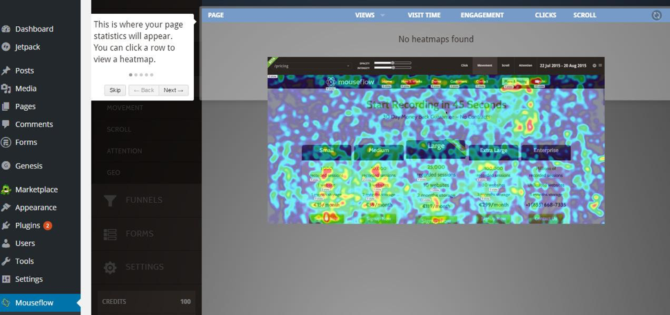 Mouseflow Heatmap
The red areas are where visitors are hovering most with their mice. As an entrepreneur, you can use this information to fine tune your offerings and discover the preferences of your user base, and iterate accordingly.
As a writer or designer, you can use this information to strategize what you’d like to visually emphasize to get more attention.
The Art of Seeing What Isn't There
Let’s play Sherlock for a minute, shall we? Because heat maps are not only useful for showing you what people are seeing – they’re invaluable for showing you what visitors aren’t seeing.
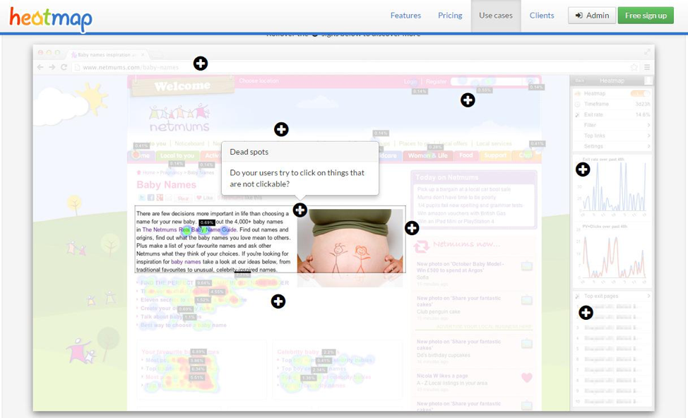
Look at this example from Heat map.me. See where all of the hot spots are? Notice where they aren’t?
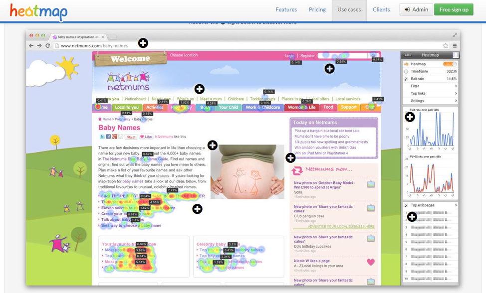 Heatmap.me example
Images usually attract attention – that’s their sole purpose really. So if you have an image that isn’t getting any attention – you’ve done something wrong. This image misses two opportunities. The first is that it’s not particularly compelling, which is why it doesn’t even rate a cool glance. The other is that studies have shown that captions below images are read more often than any other text on the page. This image doesn’t have a caption.
 Heatmap.me example
When you’re optimizing for conversion, you’ll want to use your images to attract attention AND include captions that either serve as a CTA, or reinforce a core theme you want your visitors to know.
Misdirection – Great for Houdini, Bad for You
People are easily distracted – oooh shiny object! What was I saying? Oh yes – people are easily distracted, especially by images. You can use this to your advantage by creating visual cues that point people in the right direction. Check out this subtle visual cue – see where the model’s eyes are looking on this dating site? Right at the CTA (call to action).
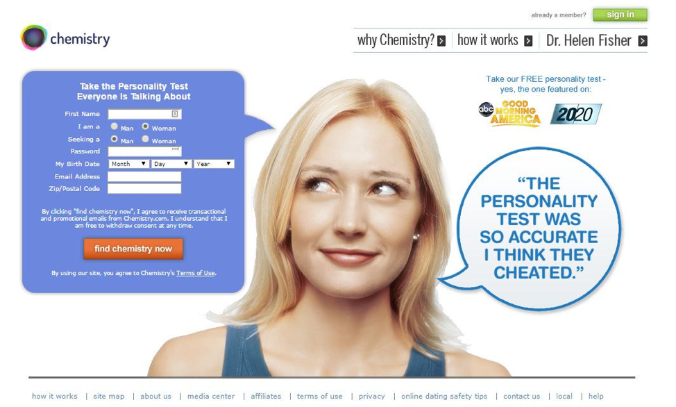 CTA (call to action) example
But, many web pages point in all kinds of directions with their images and design, so instead of coming to a page and being directed towards completing one desirable task, the visitor is overwhelmed. Hotjar shows us what this looks like in practice.
 Hotjar example
Cursor activity, ideally, should be focused on your page’s key message and CTA buttons. If you see a heat map with a haze of cursor strokes, your visitors are likely confused and don’t know what they should be doing on your page. Your conversion rates will suffer.
But, before you re-work the entire page, look to see where the highest concentration of heat is. What are the words that your audience sees as key (rather than what you planned as your key words). If these words or phrases resonate with your messaging, you might want to display them more prominently. If they don’t – then consider re-working your messaging altogether (because visitors are likely getting the wrong idea).
Making the Good Even Better
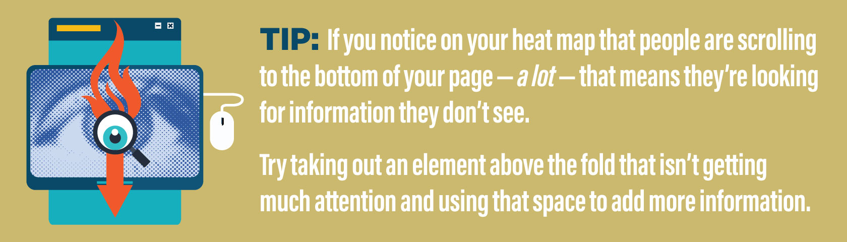
Using heat maps to optimize your site is easy – if you decipher the clues correctly. For example, if you see little activity above the fold, but lots of activity around an image below the fold – you should try moving that image up.
Some click-tracking programs (which are sometimes folded into heat mapping programs, like Crazyegg in the image below) will not only show you where visitors click, but also segment clicks by referral sources and search terms, which means you can see what images, CTAs and words on your page resonate with your most profitable audiences. Cool eh? I mean, hot! Try doubling down on what works by moving these pieces to more prominent positions on the page.
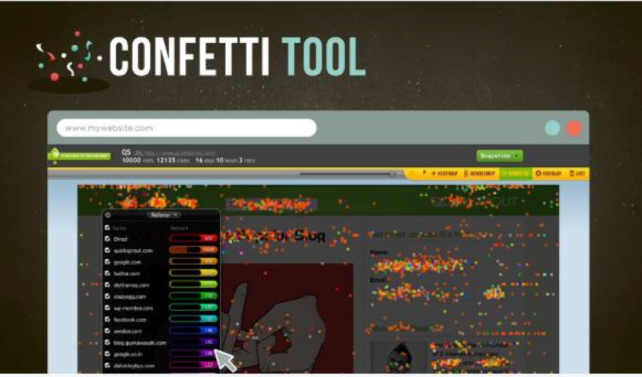 Crazyegg example
Word to the Wise
Back to the finger on the page metaphor – do you ever notice that your finger isn’t actually on the word you’re reading, but maybe right next to or below it? Same thing happens on websites. So even though the hotspots might be on one set of words, always look around and see if there is another set of words nearby that might actually be getting the attention.
Heat maps aren’t perfect. Even the best are open to interpretation. Think of them like the Greek Oracle – she’ll point you in the right direction and give you a hint about what to do once you get there, but the rest is up to you.
And hey, if you discover that an image isn’t working, you don’t have to spend an hour in Photoshop to reconfigure it. Try a tool like Visage that lets you move text, charts and visuals anywhere on your canvas with a quick click and drag (you can even resize the canvas itself that way). I use it for just about everything.
When You Don't Need a Heat Map
If your website traffic is low, a heat map might not be representative of how your site will work when your numbers rise (in this case, try an algorithmic tool like Feng GUI or eyequant to optimize page layout and images).
If you have some traffic, it can be helpful to see exactly what users are doing – and that’s when you want to move from a heat map into session recording program like SessionCam or Hotjar. With these, you can watch your actual users work their way through your site, fill out your forms and abandon their carts (kidding! Not really). In all seriousness, if you are getting partial form fill-outs, recording user sessions can yield a lot of answers.
5 Heat Map Programs to Try
- Mouseflow shows where people click, touch, move and scroll, and supports custom date ranges, mobile/responsive layouts, and A/B testing. It also tracks user activity from one page to the next, so you can see which paths successful customers take and where you’re losing the rest. There’s a free version, and it’s insanely easy to install.
- Heatmap.me offers real-time heat maps that show up on your screen in seconds and update constantly – ideal for websites with lots of traffic and content that changes regularly. Heatmap offers the neat trick of overlaying the heat map right on the pages, so you can browse through your website and see what everyone else is looking at. Heatmap offers a Free basic package.
- Hotjar, in addition to heat mapping, offers on-page Feedback Polls, so if your users are behaving in a way that is utterly inexplicable to you, you can ask them why. Their mobile heat map reports are also handy for checking how your visitors experience your site on their desktops versus on their phones or tablets. Hotjar offers a Free basic package.
- SessionCam records actual user sessions, which is handy for troubleshooting conversion issues. It’s like screensharing with a user, but anonymously so it’s less creepy. SessionCam also offers heat maps, form analytics and conversion paths. Offers a free trial.
- CrazyEgg offers heat mapping, scroll tracking and click tracking. What’s really cool is how it color codes clicks by where the user came from (referrals or search terms) for easy segmenting. Offers a free trial, but its basic version includes most features and is only $9/month for 10 pages and 10,000 visits (ideal for new websites and small businesses).
Do you have any questions, resources or discussion points about heat maps? Leave them in the comments below!