
Human brain processes images faster than text — 60,000 times faster. That makes dashboards much more effective communicators than spread sheets full of numbers. Still, pretty dashboards alone will be of little help, with no analysis, proposed actions, or a picture of a better future.
Dashboards help quickly understand patterns and relationships within the data. In addition, dashboards need insights: new developments in tracked key performance indicators (KPIs), observations about what is not obvious. The insights become the foundation of actions needed to keep improving the business. Once you estimated business impact of every proposed action, focus on most impactful tactics first.
Focused dashboard is a key to efficient decision making. As the data becomes bigger, your dashboards should become simpler. Cut the clutter and show only the metrics that are crucial to decision making. Understand your audience, create strategic or tactical dashboards, helping your stakeholders see only what is important to them.
In this post I am going to show you how to create a strategic dashboard in Excel using Semrush data. Download the Excel file to follow along.
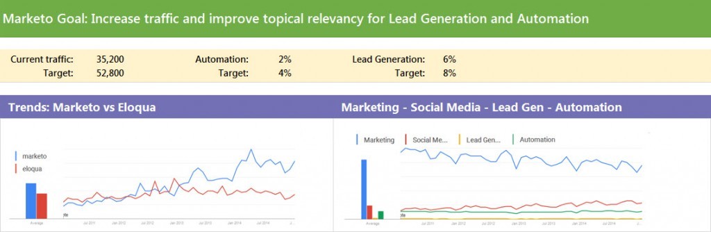
Let’s assume that we are working for Marketo. Our goal is to increase organic traffic, specifically visitors interested in lead generation and automation. We are trying to beat our competitor Eloqua in overall search visibility as well as specific topics. Our audience is C-level executives who want to estimate the effort needed to reach the goal. Our dashboard needs to show the competitive landscape for targeted queries, a high level benchmarking (Marketo vs. Eloqua), and a prioritized action plan.
First, we need to establish Marketo and Eloqua organic visibility baseline for relevant topics. Next, we must look at the quality and quantity of organic traffic for these topics. Then, we should come up with an action plan to increase visitors to the website who are interested in lead generation and automation topics and products. And finally, our goal is to communicate the plan to our stakeholders through a strategic dashboard.
Plan
Always start with planning. We have the goal, we know the audience. We need to plan what data we will need to illustrate baseline, organic visibility and topical ranking. I usually sketch the layout on a whiteboard or paper. It helps plot out the visual elements, like charts and graphs, along with the analysis. Remember: elements that are placed close to each other appear related.
Data we will need:
- Search trends: brand searches and topical searches volume over 3 years. It will answer the question which brand is stronger. It might also require adjustment to our strategy: if, say, search volume for automation is decreasing, it might not be a good investment.
- Traffic data: organic traffic segmented by topic (keywords and ranking).
- Traffic value: cost of organic traffic if we were buying it (AdWords data).
Gather and Modify Data
Google Trends is a good tool to illustrate topical trends. Therefore, we would put screenshots for the topics’ search volume at the top: Marketo vs. Eloqua as well as industry topics both companies rank for. Then, we will explore each company’s organic visibility and ranking, determine how competitive the search queries are. Lastly, we will compare traffic volume with corresponding traffic value (quality).
Semrush data can help us with the last two data sets. Run reports on both Marketo and Eloqua. Export organic top keywords into Excel. These will be your raw data sheets (blue tabs in the downloaded Excel file). Click anywhere inside the data and insert a table (Ctrl-T) on both sheets.
We will need to make slight modifications to the data sheets.
I like to calculate weighted ranking to differentiate between positions 1-3, 4-10, and 11-20. Add 2 columns (D and E) and create a weighted score for each keyword ranking and previous ranking using this formula:
=IF(Table1[[#This Row],[Position]]<4,3,(IF(Table1[[#This Row],[Position]]>10,1,2)))
=IF(Table1[[#This Row],[Previous Position]]<4,3,(IF(Table1[[#This Row],[Previous Position]]>10,1,2)))
Translation: Assign 3 points to each keyword that ranks in the top 3 search results, 1 point to keywords on the second page, the rest gets 2 points (first page, not top 3). This will allow us to evaluate not only traffic that these keywords are driving, but the ranking value as well.
Data Analysis
Look through the keywords for both Marketo and Eloqua. You can quickly see similar topics: marketing, social media, lead generation and automation. There are many branded queries, so we will need to separate them. Let’s create pivot tables that will pull data we need into analysis sheets.
In addition to raw data sheets, I advise to create data analysis sheets to make necessary calculations. In the sample Excel file look for green tabs: competitive analysis and visibility analysis tabs. We will also stage charts here and then move them to the dashboard.
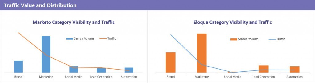
The competitive analysis tab contains data illustrating category visibility and traffic. We will need % of traffic, competition, search volume, and weighted ranking for each topic. Go to the Marketo sheet. Click on Insert -> Pivot Table -> New Worksheet.
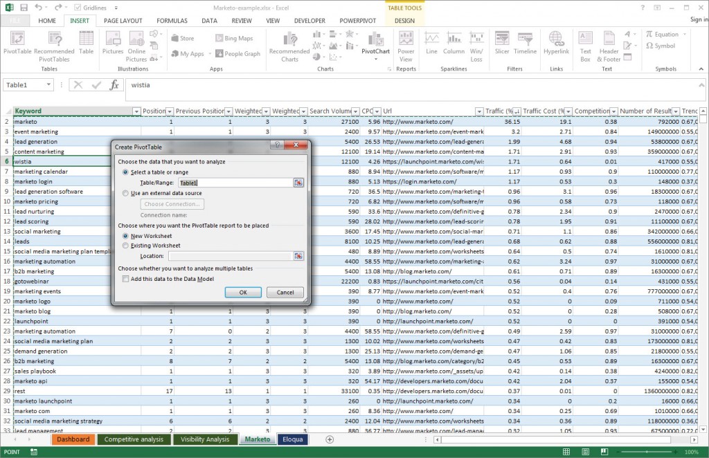
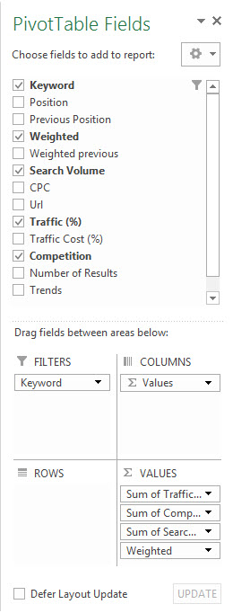 Add Weighted, Search Volume, Traffic (%), and Competition in Values (Sum) and Keyword into Filters.
Click on B1 to pull filter settings, check 'Select Multiple Items' at the bottom, and enter “marketo” in the search field. Only branded results will be included in the table.

Create 4 more pivot tables from Marketo sheet, insert them into competitive analysis sheet below the brand pivot table. Filter keywords by “marketing,” “social media,” “lead gen,” and “automat.”
It is important to note that you will get same keywords in different topics. For example, the phrase social media marketing plan template, it will appear under social media and under marketing. For our purposes, such duplication is what we are looking for.
Build out the same tables for Eloqua. Then, build your data tables in the middle. We will use them to create charts. You can see finished competitive analysis sheet in the example Excel file.
Visibility analysis sheet focuses on Marketo and Eloqua visibility for the topics we selected. Data on this sheet compares Marketo and Eloqua traffic to competition for their respective keywords. It will help us understand how competitive the keywords are. Search volume of the queries and traffic they are bringing to the website will allow us to estimate online visibility. Search volume for each category paired with weighted keyword value will clarify topical visibility of each company. And finally, comparing traffic distribution for each company side by side, will show us which topics are more relevant to which company.
Follow the same process to pull data in visibility analysis tab. Using the same topics, pull weighted value of the traffic and traffic cost (estimated price of that traffic in AdWords). The numbers are not exact, but they will show us how valuable is the traffic that the queries are bringing to the website. If possible, track the data for several weeks to show the value trend.
Create Dashboard
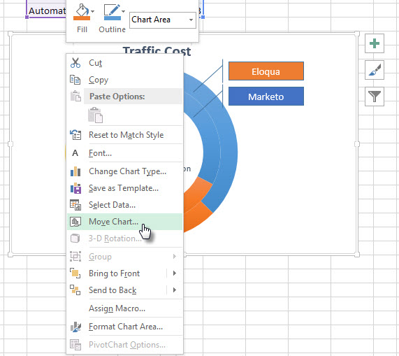
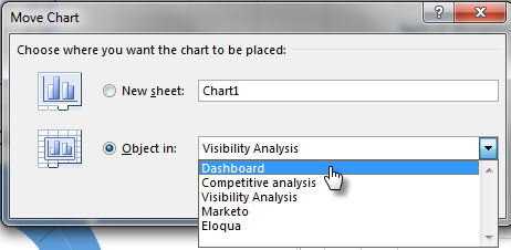
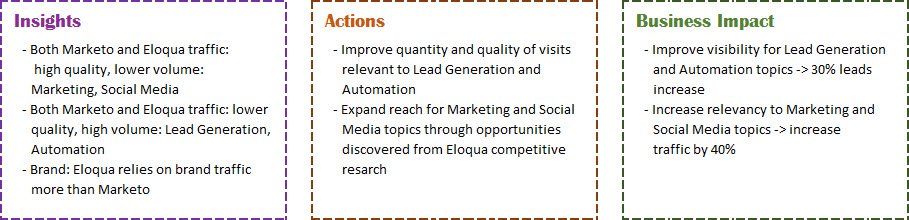
Once you've created all the graphs and charts you need in your analysis tabs, it is time to move them to the dashboard. We are going to show traffic trends, traffic data as benchmark, and traffic value. Most importantly, we are going to show insights, what actions we can take based on them, and how those actions will affect the business and its bottom line. We also need to set some goals and targets: by how much we are going to improve overall traffic, as well as automation and lead generation relevant visitors.
Create a new sheet and name it 'dashboard.' Right click on the chart, select Move Chart from the menu —> Object in Dashboard. Move all the charts you created in analysis sheets to the new dashboard sheet.
Add a couple of screen shots from Google Trends, and you are ready to format your dashboard.
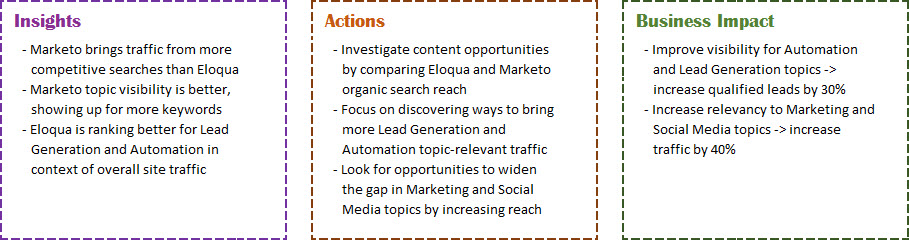
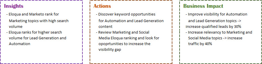
Here is the result — strategic dashboard. You can choose to create just one set of insights, actions, and business impact predictions. I created several to illustrate how to interpret each set of data.
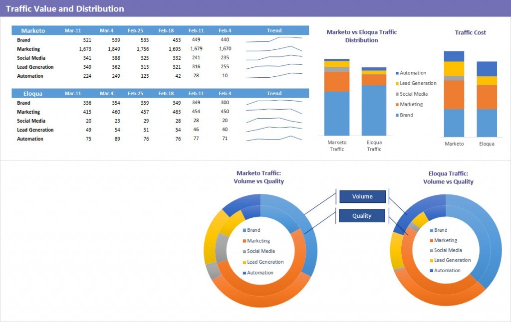
There are a couple different ways to show the data on traffic distribution. I wanted to show the options: stacked or doughnut.
For the advanced marketers, you can add your Analytics data to Semrush data (landing pages) and include such metrics as page value, bounce rate, page views, etc. to further illustrate your hypothesis.
Final Thoughts
Here we have it — a checklist for creating effective dashboards.
- Always start with your audience in mind. Plan your dashboard to make your points apparent to key stakeholders.
- Cut the clutter. Use less to highlight the most important points.
- Understand how your audience thinks and pick just the right chart to illustrate your point.
- Always provide your analysis with the charts. Explain what to do next and why. Always tie your actions to the business goals and advise to start with most impactful first.
- Define next step and set expectations. Often, the next step is a tactical dashboard to track specific campaigns. Go to the functional teams with your proposal, pick KPIs and targets to support your strategy. Take your plan and make it a reality.
I have not covered in detail how to create charts. There is a lot of helpful tutorials and Excel tips on Annie Cushing’s blog — Annielytics.
Please share in the comments how this post helped you create better dashboards.