
What Is SEO Competitor Analysis?
An SEO competitor analysis (also called an SEO competitive analysis) is the process of researching your competitors to gather insights about their keyword, content, and backlink strategy and using those insights to improve your own SEO.
In this article we’ll cover:
- Why an SEO competitor analysis is important
- How to run an SEO competitive analysis
- How to create an actionable competitive analysis report (+ share a free template)
Why Is an SEO Competitor Analysis Important?
Understanding who your competitors are and analyzing their strategies and tactics is an integral part of any SEO strategy.
Why?
Because your business doesn’t live in a vacuum.
There are tens, if not hundreds, of websites with content similar to yours. And they’re fighting for the same spots in Google.
And an SEO competitor analysis is the best way to stay one step ahead.
It can help you identify who’s ranking highly for your target keywords so you can:
- Discover their winning strategies (and replicate them)
- Uncover their weaknesses (and capitalize on them)
- Benchmark your current SEO performance against them
And more.
Now, it’s time to discuss how to do it.
How to Run an SEO Competitive Analysis
Let’s walk through the process of performing an SEO competitor analysis.
Identify Your SEO Competitors
SEO competitors are websites that are ranking in organic (unpaid) search results for the same keywords you’re targeting.
You can find them by searching for your target keywords on Google. One by one. And seeing who ranks in the top 10.
But a better way is to use the Organic Research tool.
First, enter your domain, select your country, and click “Search.”

Now, scroll down to the widget labeled “Main Organic Competitors.”

These are the top five websites you’re competing with in Google’s top 20 search results.
To see the list of all your SEO competitors, click “View all # competitors.”

The tool will show the “Competitors” tab. And you’ll see a table with all of your competitors.
Like this:

Now you know exactly who your SEO competition is. This is the perfect place to start for a competitive analysis.
Find (and Close) Keyword Gaps
A keyword gap is the difference between the keywords you rank for and the keywords your competitors rank for.
More specifically, the keywords your competitors are ranking for, but you aren’t.
Each one of those keywords represents an opportunity for you to bring in more traffic.
To find keyword gaps, use the Keyword Gap tool.
Start by entering your URL and up to four competitors’ URLs. Then, click “Compare.”

In the dashboard, scroll down and you’ll see a table with tons of keywords.
Now, click the “Missing” filter to see the keywords all of your competitors rank for, but you don’t.

You now have a list of keywords you can use to create content to try to fill in those gaps.
Further reading: How to Use Competitor Keywords to Improve Your Strategy
Uncover Sitewide Strengths and Weaknesses
Every website has multiple weak points. Even dominant players like Amazon or eBay.
Identify your competitors’ strengths and weaknesses by considering these factors:
Authority
“Authority” is an SEO concept that refers to a website’s overall quality. It predicts how well a site will rank on Google.
At Semrush, we use a metric called “Authority Score.”
It runs on a scale out of 100. And it’s based on the quality and quantity of a site’s backlinks (links from other sites that point to the site in question), organic traffic, and other factors.
The higher the score, the better the chance of ranking higher for relevant keywords.
You can find any domain’s Authority Score (AS) in the Link Building, Domain Overview, Backlink Audit, or Backlink Analytics tool.

You can also compare multiple Authority Scores with the Bulk Backlink Analysis tool.
To start, enter your URL and up to 199 competitors’ URLs. And click “Compare.”

The tool will then show a table with all the URLs you entered.
You’ll see each URL’s Authority Score in the column labeled “AS.”

This makes it easy to compare your score to your competitors’ scores.
Don’t worry too much about exact numbers. But do try to improve your site’s authority over time.
One of the most effective ways to do that is to build high-quality backlinks.
These act as “votes” of confidence from other sites. And signal to Google that your site is trustworthy and valuable.
We’ll dive more into backlinks in a later section.
Further reading:
Content
Content plays a big role in an SEO competitor analysis. Because content brings in traffic.
And if you analyze your competitors’ best-performing pages, you won’t have to guess which types of content will drive the most traffic.
You can just see what’s working for them. And replicate it in a similar or better way.
First, go to Organic Research—an SEO competitor analysis tool.
Enter any competitor’s URL and click “Search.”

Then, in the dashboard, click the “Pages” tab.
You’ll see a table with your competitor’s top-performing pages—sorted by the estimated amount of traffic they bring in.
Like this:

Now, dig a little deeper. Click on the icon next to each URL to open each page.

Examine these pages carefully. And look for patterns.
For instance:
- Is the content mostly long-form or short?
- Do they use lots of videos or images?
- Are they mostly product pages, blog posts, or something different?
Let your answers to these questions guide your content production. To take the guesswork out. And recreate what’s already working—in a better way.
Technical SEO
Technical SEO is the process of optimizing a website for search engines and improving the user experience.
And it can greatly impact your site’s performance in Google’s search results.
Which means:
Analyzing your website’s technical SEO health and comparing it against your competitors is a key step in your competitor analysis.
To get started, open Site Audit, enter your domain, and click “Start Audit.”

After you adjust your Site Audit settings and run the audit, you’ll see a dashboard displaying information about your site’s health. And other reports.
Like this:

You can go to the “Issues” tab to see a list of your site’s errors, warnings, and notices.

The tool also offers advice on how to fix each issue. Just click “Why and how to fix it” next to a specific issue.

Running a monthly site audit is crucial. You can find and fix technical issues before they can become bigger problems.
But you can also run audits for your top competitors.
Then, compare and benchmark your scores. And uncover their weaknesses so you can capitalize on them.
New Keyword Rankings
If your competitors are targeting new keywords, it’s worth knowing about. Because you may want to target the same keywords.
The Organic Research tool can help you discover new keywords your competitors are ranking for.
Open the tool, plug in a competitor’s URL, and click “Search.”

Then, navigate to the “Position Changes” tab.

And filter the “All Position Changes” report to show only new keywords. Then, click “Apply.”
Like this:

The table will only show new organic keywords your competitor is ranking for.
As well as the ranking position and the estimated change in traffic driven to their site by each new keyword.

Analyze each keyword individually.
And identify whether you need to create new pages to target these keywords. That could include blog posts, product pages, or category pages.
To determine the type of page you need, look at the keyword’s search intent (i.e., the reason behind a user’s search) in the “Intent” column.

For example, if the intent is “I” (meaning informational), you might want to create a blog post.
But if the intent is “C” (commercial) or “T” (transactional), you might be better off creating a product page.
If you’re still not sure, search the term on Google to see what type of pages rank at the top. And replicate them.
Further reading:
Lost Keyword Rankings
When a competitor loses keyword rankings, you could turn them into wins for your site.
You can see the keywords any competitor has lost in Organic Research.
Again, open the tool, enter any competitor’s URL, and click “Search.”

Then, go to the “Position Changes” tab.
From there, apply the following filters:
- Top 20 positions in the search engine results pages (SERPs)—to see only the most relevant keywords
- Position changes: Lost—to see which terms you can capitalize on

Then, you should see a table like this:

These are keywords your competitor used to rank in the top 20 for but later lost.
A site can lose keyword rankings for a variety of reasons. Maybe it was affected by the latestGoogle algorithm update, for example.
Regardless, these keywords represent an opportunity.
If you already have pages targeting these keywords that aren’t ranking well, optimize them.
For example, you could:
- See if the page matches the keyword’s search intent
- Check for any on-page SEO issues like too few backlinks or hard-to-read text
- Update the content with more recent research
Further reading:
Analyze Sites on a Page-by-Page Basis
Now, let’s take it a step further. And analyze competitor pages one at a time—particularly for pages ranking for keywords you don’t yet rank for.
Here are the most important on-page SEO factors (things that have to do with your webpage content) you should look into for your SEO competitor analysis:
Title Tags
A title tag is an HTML element that indicates the title of a webpage. It’s what you see in search engine results, social media posts, and browser tabs.
Like this:

Title tags help signal to Google what your pages are about. And optimizing them is one of the easiest ways to improve your rankings.
Which is why you should look at your competitors’ title tags. Especially the ones that outrank you.
When you do, ask yourself:
- Do they integrate keywords better than you?
- Do the target keywords appear near the beginning of the title tags? At the end?
- Do they include special, click-enticing modifiers like “easy,” “best,” and “free”?
The answers to these questions should give you an idea of how to craft your title tags—so you can boost your rankings.
Meta Descriptions
A meta description is a short snippet of text that summarizes a webpage’s content. And appears in the SERP.
Like this:

Meta descriptions aren’t a direct ranking factor. But they can affect (and improve) click-through rates.
Meta descriptions are often overlooked. Particularly on large sites. So, don’t make that mistake.
Instead, see how your competitors use meta descriptions. Notice what’s working and what isn’t. And adjust yours accordingly.
URL Structure
URL structure is the order, compartmentalization, and grouping of webpage URLs within a website.
Like this:

Your URL structure affects how easily users can navigate a site, find specific pages, and find specific content.
Ideally, a URL structure is intuitive, clear, and organized.
Study your competitors’ URL structures on the pages that outrank your pages. And ask yourself:
- Do they integrate keywords in their URLs? If so, how?
- Do they use shorter URL slugs?
- Do their URLs describe the page content?
If you notice something you can improve, you can act on it so your URLs are as good as—or better than—your competitors’.
Content & Keywords
This step in your SEO competitor research involves taking a deeper look at the pages that outrank you. And analyzing their content.
As you do, ask yourself:
- How are they using keywords throughout the page?
- Are there relevant secondary keywords you could add to your content?
- Is the writing of high quality?
- Do they cover topics in a similar level of detail to you?
After your analysis, use our SEO Content Template and SEO Writing Assistant to create better, more impactful content.
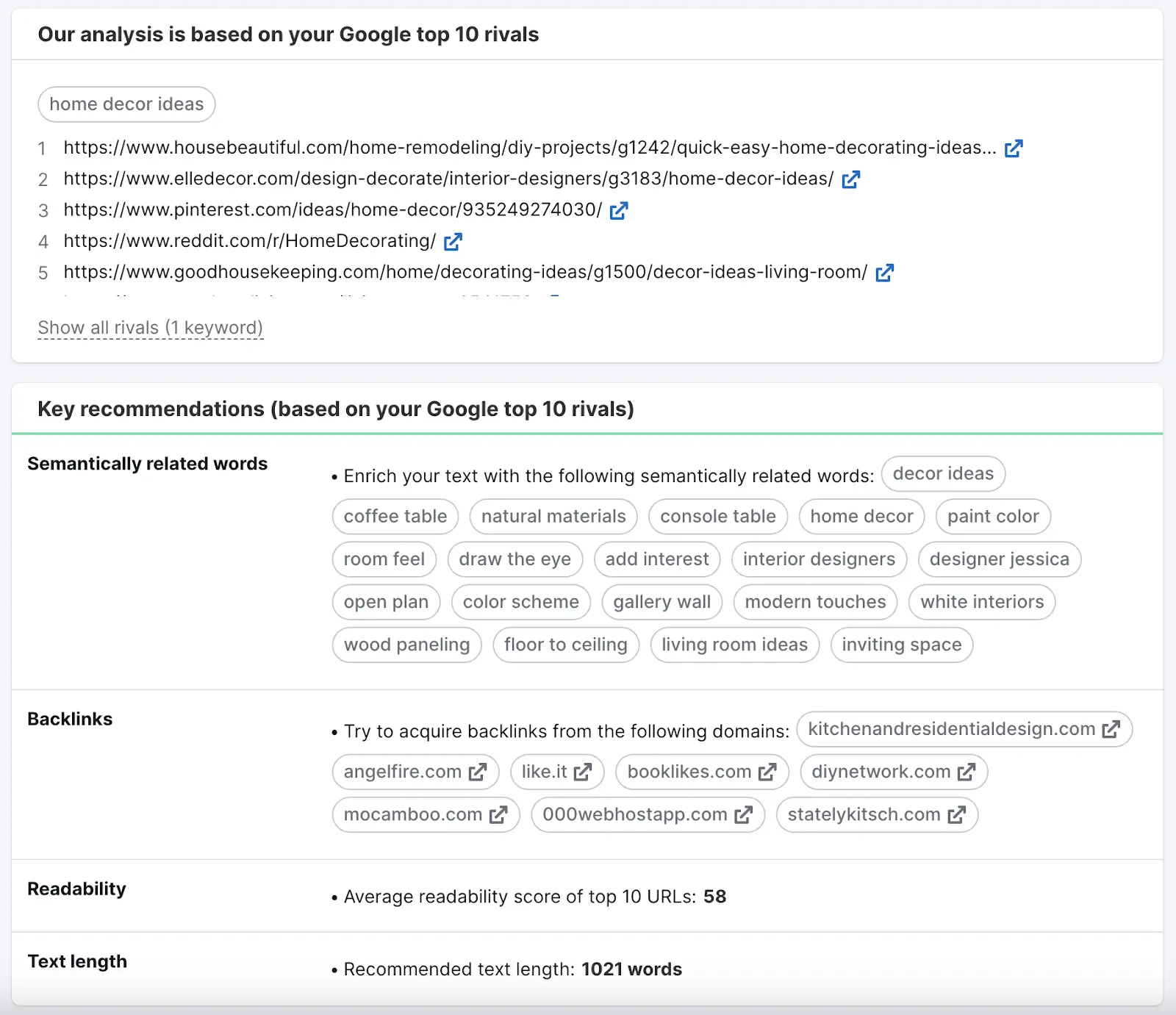
Say you want to create a blog post centered on the term “home decor ideas.”
Open SEO Content Template, enter your keyword, and click “Create content template.”

The tool will analyze your top 10 rival pages and offer suggestions—like semantically related keywords you can add, specific referring domains you can build links from, information about readability, and more.
Like this:
And when you start writing, the SEO Writing Assistant will provide real-time feedback on readability, tone of voice, originality, and SEO.
As you can see here:

If you have existing content you want to optimize, copy and paste the text into the SEO Writing Assistant.
And you’ll get ideas for quick wins.
Further reading: What Is Quality Content & How to Create It
Review Backlinks
Pages with lots of backlinks tend to rank higher on Google. Especially if those links are from authoritative and relevant sites.
And analyzing backlinks is an important part of SEO competition analysis.
Because when your competitors have better backlink profiles, you’ll have a harder time outranking them. At least until you can build a similar backlink profile.
Here are three things you can do to review your and your competitors’ backlinks:
Compare the Quality of Backlinks
High-quality backlinks are links from authoritative, relevant, trustworthy, high-traffic websites.
Low-quality backlinks (also called toxic backlinks), on the other hand, are from irrelevant websites, from suspicious domains, or involve questionable techniques.
You can quickly see your site’s (and any competitor’s) backlink toxicity score with the Backlink Audit tool.
Here’s how:
Open the tool and follow the Backlink Audit configuration guide to set up your project.
And click “Start Backlink Audit.”

You’ll see a quick summary of the domain’s important information.
Including the Overall Toxicity Score (which indicates the number and severity of suspicious backlinks), total number of referring domains, total number of backlinks, and Authority Score.

Make note of how your site’s metrics compare to your competitors’ metrics. To determine whether your backlink profile could be stronger.
Further reading: How to Do a Backlink Audit (5 Simple Steps)
Study Both Nofollow and “Follow” Backlinks
Nofollow is a link attribute that tells search engines to ignore the link—or not to “follow” it.
For example, you might link to a competitor because it’s helpful to the reader. But you wouldn’t want to imply any type of endorsement.
“Follow” links (there’s technically no such thing as a follow attribute), conversely, are normal links without any attributes. They can imply endorsement and pass ranking credit.
“Follow” links are the type of backlinks you want—if what you’re looking for is SEO value.
You can see your and any competitor’s “follow” and nofollow backlinks using Backlink Analytics.
Enter the domain and click “Analyze.”

Then, head to the “Backlinks” tab and scroll down to the table.
And toggle “Follow” or “Nofollow” to see the corresponding type of backlinks the domain has.

Consider the volume of backlinks the domain has for each type as well as the websites providing those backlinks.
This can help you better understand your and your competitors’ backlink profiles. And give you ideas for where to pursue backlinks in the future.
Further reading: Nofollow Links vs. ‘Follow’ Links: All You Need to Know
Find Your Backlink Gaps
A backlink gap analysis helps you find websites linking to competitors but not you.
If someone is linking to your competitors, they might be happy to link to you, too. Especially if your content is higher quality.
To start, open the Backlink Gap tool.
Then, enter your domain and up to four competitors’ domains. And click “Find prospects.”

You’ll see a table with a list of the websites linking to the domains you entered.
Make sure you select the “Best” filter. This will show only the sites linking to your competitors but not you.

Now, you have a list of websites you can reach out to for backlinks.
Further reading: Link Building for SEO: The Beginner’s Guide
Capture Featured Snippets
You should also pay attention to the SERP features (search results that include additional information and elements than traditional results) your competitors rank for—like featured snippets. And try to win them your own site.
To see your competitor’s featured snippets, head to the Organic Research tool.
First, enter a competitor’s URL and click “Search.”

Then, go to the “Positions” tab.
And filter the report to show keywords for which your competitors own featured snippets.
Like this:

The table will now show only keywords for which your competitor has the featured snippet.

If you have pages targeting the same keywords, optimize them to try to win the featured snippet.
Look at the featured snippet for “february birth flower,” for example:

To improve your chances of winning this snippet, you’d have to write a better, more objective answer.
Further reading:
SEO Competitor Analysis Report (Free Template)
Conducting an SEO competitor analysis is fundamental to your SEO success. Which means it shouldn’t be a one-time thing.
You need to keep up with what your competitors are doing. And try to always stay one step ahead.
A quick and easy way to do this is to use one of our report templates.
Head to My Reports and click “Monthly Competitor Analysis.”

Enter your domain and two other competitors’ domains. Then, click “Create report.”
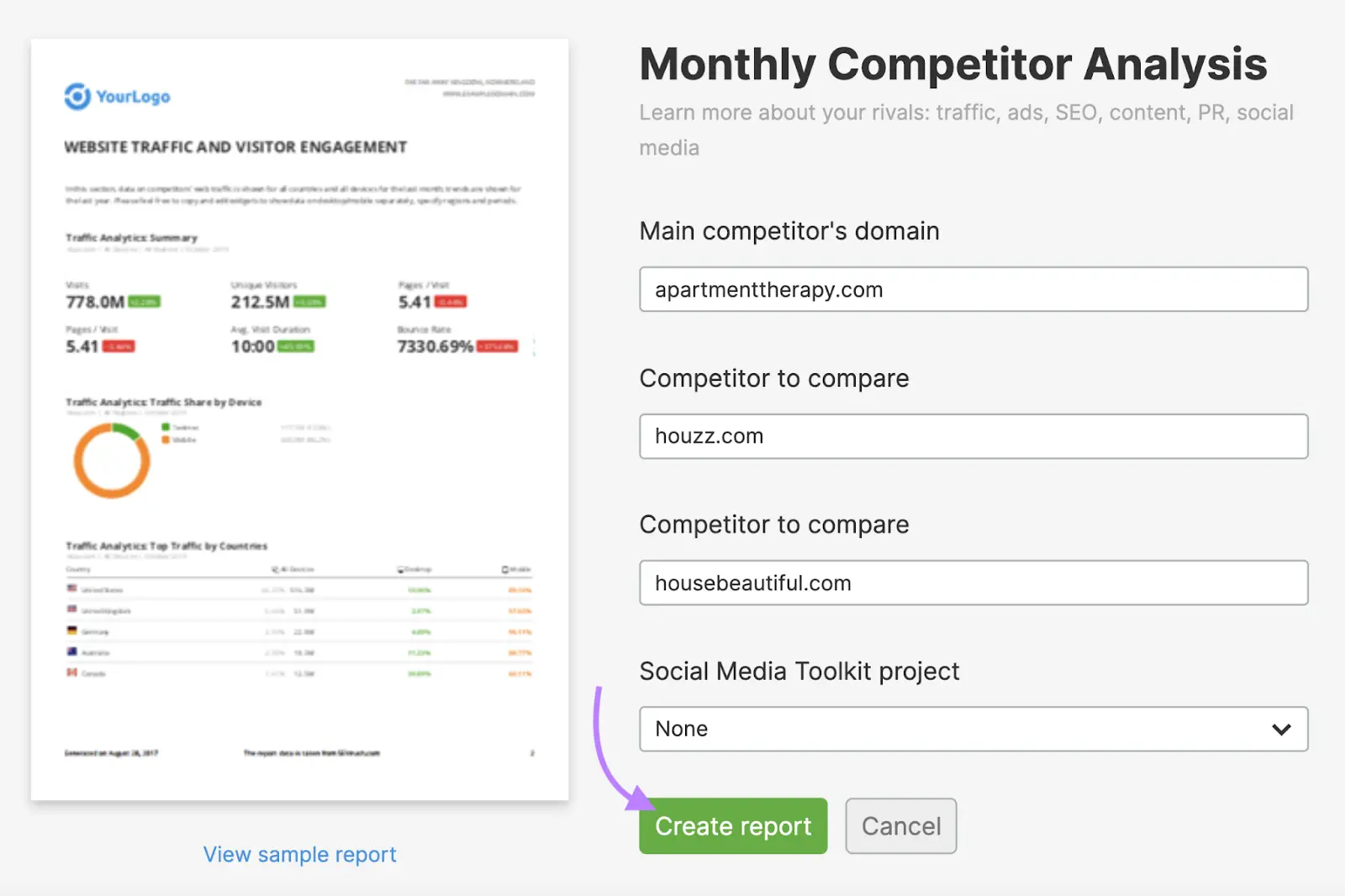
The tool will quickly create a competitor analysis SEO report.
You’ll first see a summary of your domain’s performance.
Like this:

Then, you’ll see how your site compares to your competitors.

The report is customizable. And you can edit or remove any widget you want.
For example, if you want to add more competitors to “Traffic Analytics: Competitors Comparison (Overview),” hover over the widget and click the pencil icon.

Add more competitors to the “Competitors” box and click “Apply.”

You’ll see the widget immediately display data for the competitors you added.

Once you’re done, click “Generate PDF report” on the top right.

In the pop-up window, enable “Email report” and “Schedule report.”
Select your preferred time frame for the tool to automatically run the report and email it to you.
And click “Generate and send.”

If you need to edit your report at any time, head to “My Reports.” And you should see it in your dashboard.

Now you’re set up for success.