It is really easy for people to trust data. Perhaps too easy. A 2018 Stanford University study showed people are 70% more likely to trust statements with a number in it than one without.
Even more alarming, nearly 60% of participants believed a fake headline that contained a statistic vs. only 40% who believed the same headline without the statistic.
And here is the real kicker: None of that last two paragraphs, save for the first two sentences, were true. There was no Stanford study that I know of, and I made up those numbers. That hyperlink is actually a link to the infamous 1982 “band on the field” Cal/Stanford game.
While I’m not that sorry for tricking you, it illustrates the point: Numbers (and people) can definitely misrepresent the truth. In the content marketing world, we see a lot of misleading numbers attempting to build trust with audiences. Even scarier, a lot of content producers don’t even realize they are doing it.
Not sure what I mean? I will show you with my favorite example: Google Trends.
Three Basic Rules for (Honest) Data Analysis
If you are unfamiliar, Google Trends is an incredible tool that allows you to look up the relative search volume of anything. For instance, I wanted to know when “Old Town Road” started ruining my life, so I pulled up a chart of interest over the last year.
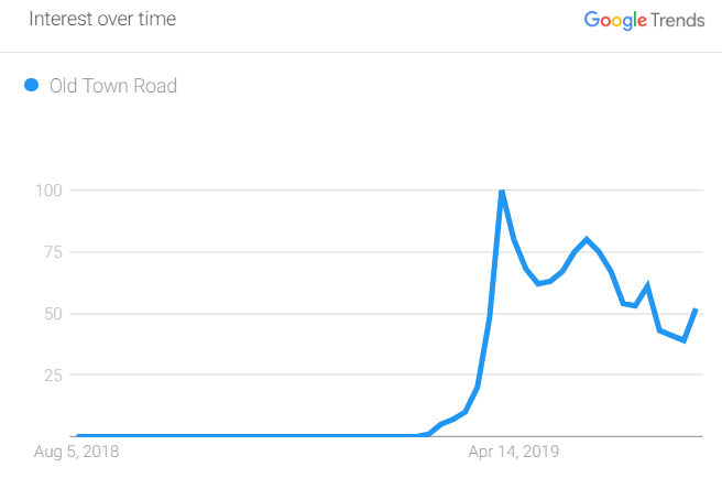
Pretty intuitive, right? According to this chart, the hit reached fever pitch around mid-April 2019. For context, the Billy Ray Cyrus Remix was released on April 5, 2019, so Trends checks out.
Now, you can probably start seeing why this is a huge tool for content marketers. It provides free, highly customizable, and authoritative data, and people believe it because it comes from Google.
But let’s look more closely at the information we got back. You may notice something unique about the Y-axis, which brings us to the first rule.
#1. Don’t Compare Apples to Oranges
In every Trends chart, 100 represents the max search volume on the chart; in this case, it is the day when “Old Town Road” was searched for the most.
This is the case in this chart and every Trends chart because every chart will, at some point have its highest point. Every other value on the chart is relative to that 100 value.
In other words, every number along the line is a percentage of the term at its peak. So, as the number hovers around 50 at the end of the chart, we can assume that at the last day in the range, it was searched for roughly half as much as it was at its peak.
The main issue we see, though, is that some content creators try to compare terms in separate charts without realizing they are completely independent of each other.
If I searched for “Baby Shark,” I would similarly see a point at 100 somewhere (as I would with any term). It wouldn’t be fair to compare that 100 to “Old Town Road”’s 100, because we have no idea what the actual search volumes are.
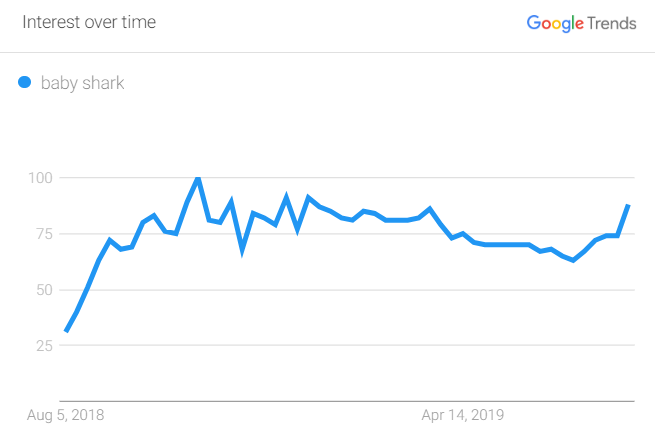
To do it properly, you would need to use Trends’ handy “Compare” feature, where you can see that “Old Town Road” had almost twice as high a peak search volume, though “Baby Shark” has been around for longer.
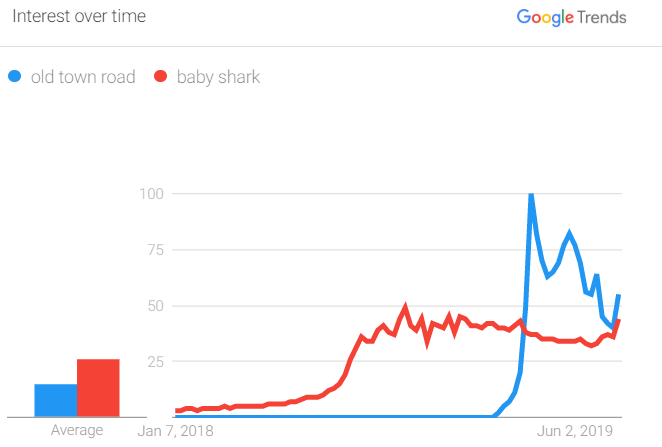
Because search interest is relative, we can’t technically say, “It had a search volume of 78,” because really, the 78 value is representing 78% of the maximum search volume.
Looking again at the “Old Town Road”/”Baby Shark” battle for my young nephew’s attention, you may have noticed something: Although “Old Town Road” had the highest high and has stayed above “Baby Shark” since it was released, the “Average” bar chart on the far left shows “Baby Shark”’s bar significantly higher; 26 to 15, to be exact (which, as discussed in Point 1, only means 26% and 15% of the highest volume on the chart, which was “Old Town Road” in April 2019).
That would leave you to believe “Baby Shark,” on average, was ~80% more searched for than “Old Town Road.” Of course, that’s misleading, because of the time range we selected, where “Old Town Road” didn’t exist. If you’re going to compare things, they always need to have had the same opportunity to achieve search volume during the time period selected.
How to Apply the Rule
Content creators need to be responsible and accountable for the figures and information they present. That means they need to do (“do do do do do do”) the due diligence needed to understand their data, what it represents, and that the claims they’re making are fair.
One test I like using is: If I was a publisher who did not want to cover this story, what would I say? This approach allows you to be critical of your data and allow you to preemptively solve problems before they come up.
#2. Stay Transparent
It is easy to get carried away with the first insight you discover and forget about the rest. But that could mean other takeaways are waiting to be revealed that are pertinent to the overall story.
Let’s look at the popularity of Lil Nas X searches across the country:

So Georgia is searching the most, right? Not necessarily. As Google explains, “Each data point is divided by the total searches of the geography and time range it represents to compare relative popularity. Otherwise, places with the most search volume would always be ranked highest.”
In plain English, Lil Nas X takes up a higher percentage of searches in Georgia than the proportion in California. If it was on volume alone, California would always be #1, because it has the highest population. Now, that may be the takeaway you are looking for (and it would be a fair and interesting one to make), but it isn’t totally what it seemed at first glance.
How to Apply the Rule
Just as content creators need to think critically about the quality of the data they are presenting, they also need to think critically about what they are not showing and the associated implications. Give a full context to your data, and say why some things are included and others aren’t.
Easy ways to do this? Include a methodology section at the end of your pieces, source graphics, and data appropriately, and feel free to add in information in the copy associated with your content. The more transparent you are with your data, the more trust you build with your audience.
#3. Understand the Sample You Are Working With
Perhaps the scariest and most abused caveat to Trends data is that everything it presents—each data point, chart, comparison, state ranking, and more—is based on a sample. And Trends admittedly handles and interprets to make it more interesting (and usually, relevant), to a search.
Google is not querying the hundreds of millions of searches it is receiving when making these; instead, it is using a very small sample of their searches. I don’t blame them—it would use a ton of resources for this free tool to do that kind of analysis properly, especially with constantly changing data. To Google’s own admission, Trends data “is a random sample of Google search data that can be pulled from as far back as 2004 and up to 36 hours before your search.”
What does that mean? Your results will be drastically different every time you search.
About a year ago, I wanted to find the most common home-cooked dish in every state. I thought that finding the most popular “_____ recipe” in each state over the last year would create an interesting infographic.
I typed in “recipe” as the trends I wanted to see, and I used the “related searches” tool for each state to see what came up. Here was my Alaska result:
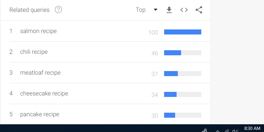
You could imagine a state-by-state map with an image of the recipe as a fun piece of content. But watch what happens when I refresh my page:
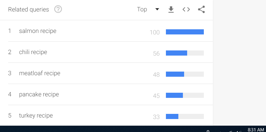
Check those timestamps: These screenshots were taken 1 minute apart and have considerably different data. It is important to know that every variable in my search remained identical and had contained dates, so in theory, they shouldn’t be different at all.
You can see how tempting it would be to create bad data science using these findings.
How to Apply the Rule
Test, test, and test your data; this goes for all types of content but especially for anything that might be live updating, changing, or isn’t necessarily evergreen. When building interactive content, I spend significant time attempting to break the final version before I am comfortable putting it on the internet. If someone is going to find bugs, I would prefer it be me.
With respect to your data set, it is helpful to ask yourself: Would another person be able to reconstruct my work and come up with the same result, given the same tools? If not, be transparent about why that is and what you did to get to the conclusions you reached. If link building is your goal, publishers will appreciate and often even cite the transparency.
Why This All Matters
For content to be able to succeed on the internet, we need to be able to trust it. As content marketers or anyone who cares about data, we have a responsibility to use tools like Trends wisely and honestly. Here are examples of how to do this:
-
Detailing methodologies on how and when data was pulled.
-
Explaining a study’s limitations.
-
Clearly stating potential biases.
-
Properly attributing your information.
-
Listing sample sizes and margins of error.
In some pieces of content, these will be more present than others, and even I will admit to worrying about undermining my own content. But at the end of the day, I would prefer to give people an honest view of what they are looking at and let them decide the takeaways for themselves. Publishers, news outlets, and history will likely feel the same.
