The Traffic Analytics Overview report allows you to gather estimates on any website’s traffic and make comparisons between up to 5 websites at a time in order to learn more about your rivals' strategies, explore user behavior, and reveal trends in your target market or niche.
Overview Metrics
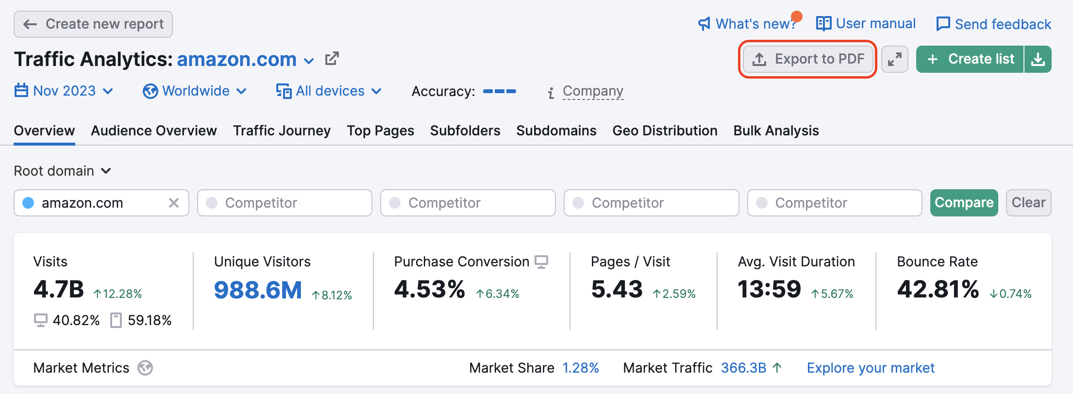
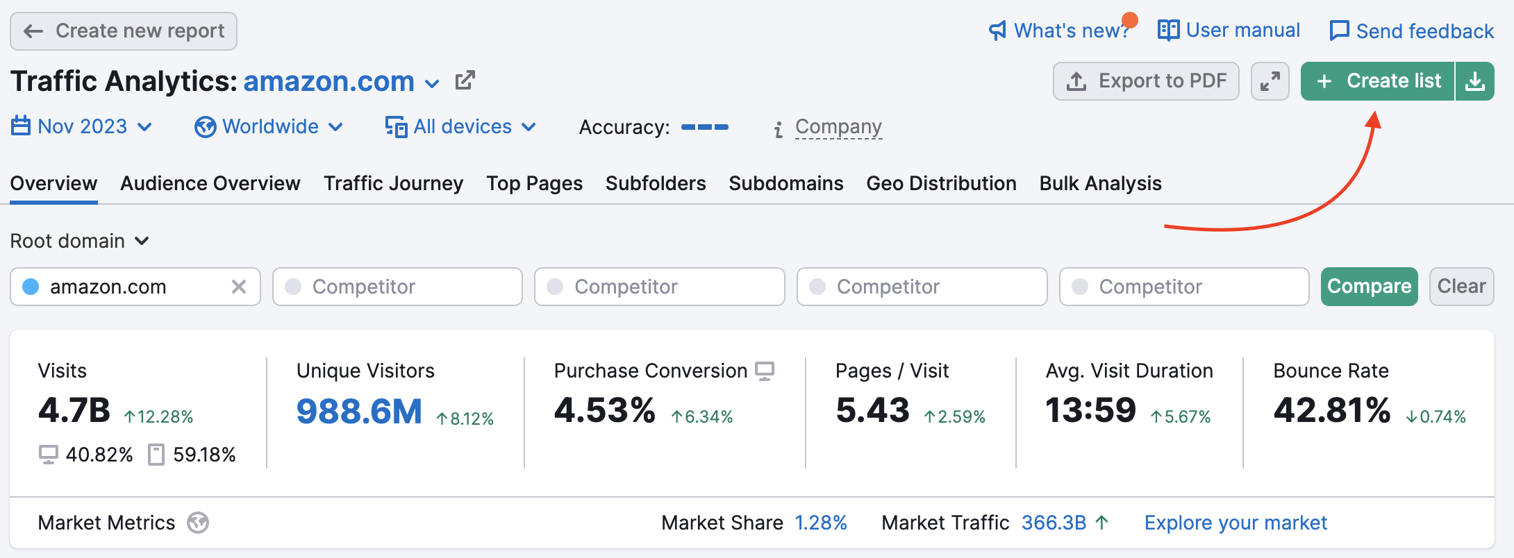
The report starts with estimates of the queried website's traffic and engagement. You'll notice a set of bars next to the top filters noting the Estimated Accuracy of the report - which is based on the size of the domain, sample of clickstream data for this domain, and any filters you have applied (historical data, location, device).
- Visits - an estimate of total visits to the website over the chosen month
- Unique Visitors - an estimate of total unique visitors to the website over the chosen month
- Purchase Conversion - estimated percentage of sessions that ended with a checkout
- Pages/Visit - an estimate of how many pages (on average) a person visits in one session on the website
- Avg. Visit Duration - an average estimate of the amount of time spent on the site during each visit
- Bounce Rate - an estimate of the website’s average bounce rate, or percentage of visitors that leave the website after viewing just one page
The numbers in red or green beside the metrics indicate the change in the metric compared to the previous month.
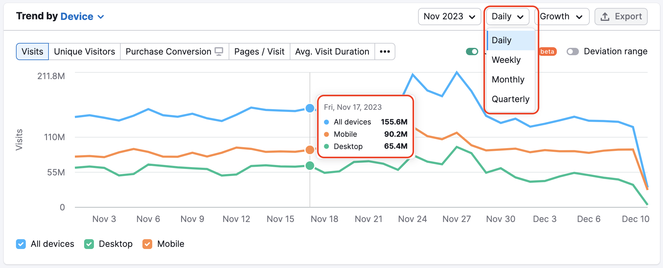
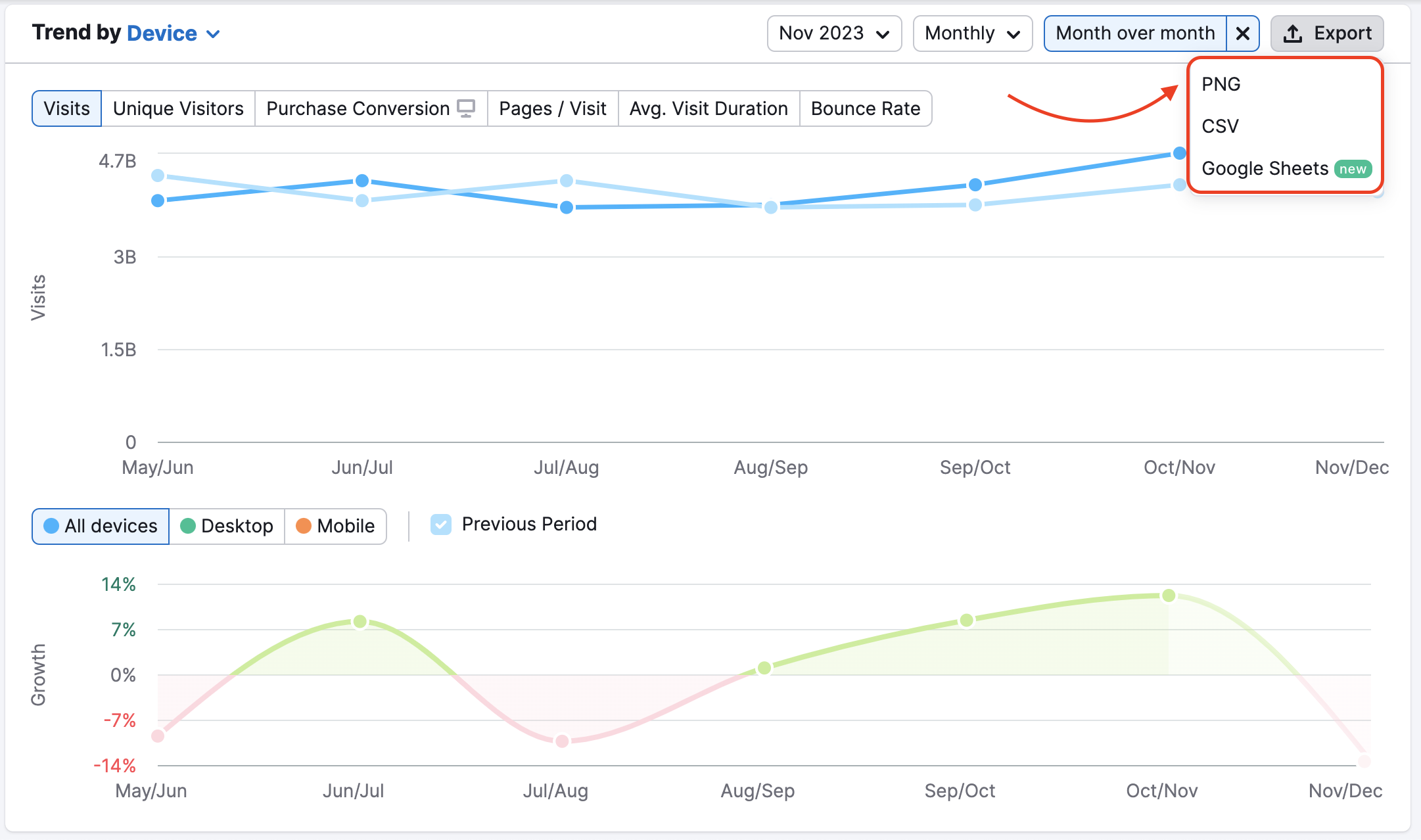
The trend graph below the metrics shows the queried domain’s trends in traffic volume over time, including desktop traffic, mobile traffic, and all devices. You are able to switch the graph between the device and the time period. The graph also allows you to switch between a domain’s trend of total visits, unique visitors, purchase conversion, pages viewed per visit, average visit duration, or bounce rate.
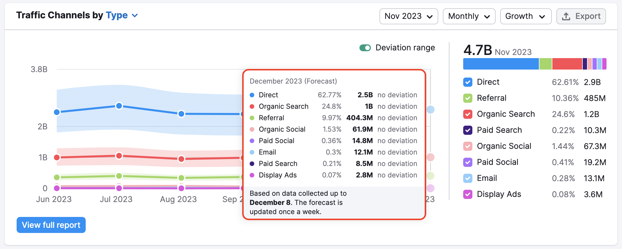
You can view data on a daily, weekly,quarterly, or monthly scale. Historical data is indicated on the graph by a darker shade, while forecasted data projecting the current month’s anticipated performance is lighter. Forecasts are based on the current month’s performance so far and are updated weekly.
To view more information about the forecast, such as the specific traffic data currently included in the projection, and specific metrics, place your cursor over the line indicating the forecast you want to learn more about.
This graph could be used to understand the overall dynamics of the company’s website success and seasonal trends, as it helps locate traffic spikes related to marketing campaigns or any other reasons to research them further.
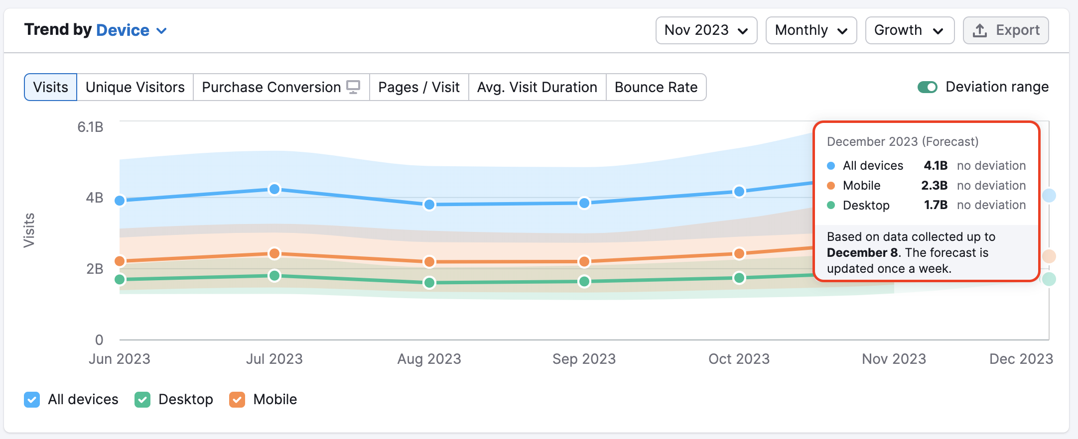
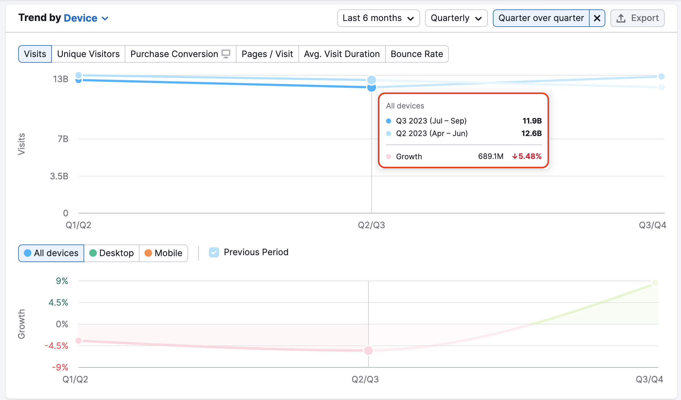
If you activate the “Deviation range” switch, you will be able to see the high and low-end values of our estimations for a particular month based on the data we gathered.
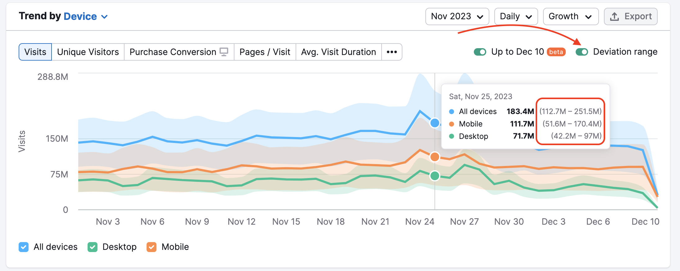
The deviation range is meant to show the level of accuracy in estimations of a certain metric. If the range is wider – the estimations are less precise, and when it’s thinner – they are more precise.
Additionally, you can enable the Growth chart in this widget. There are three period modes available: Month Over Month, Year Over Year, and Quarter Over Quarter.
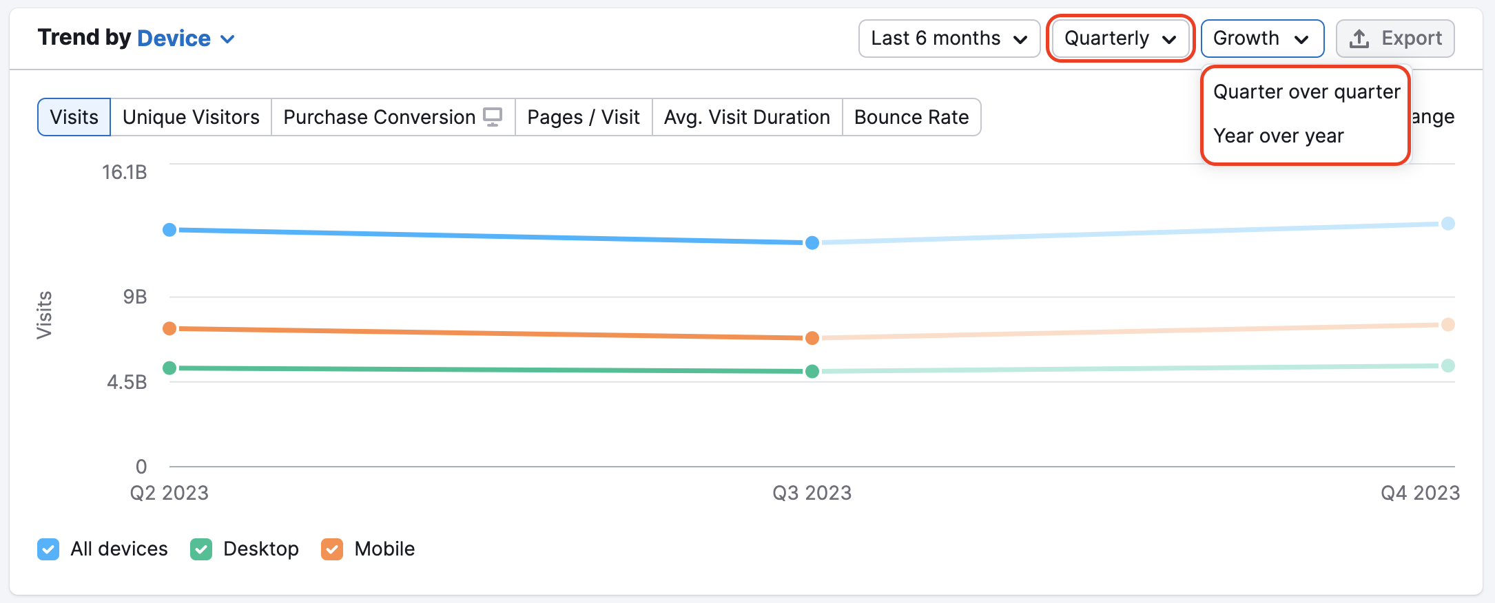
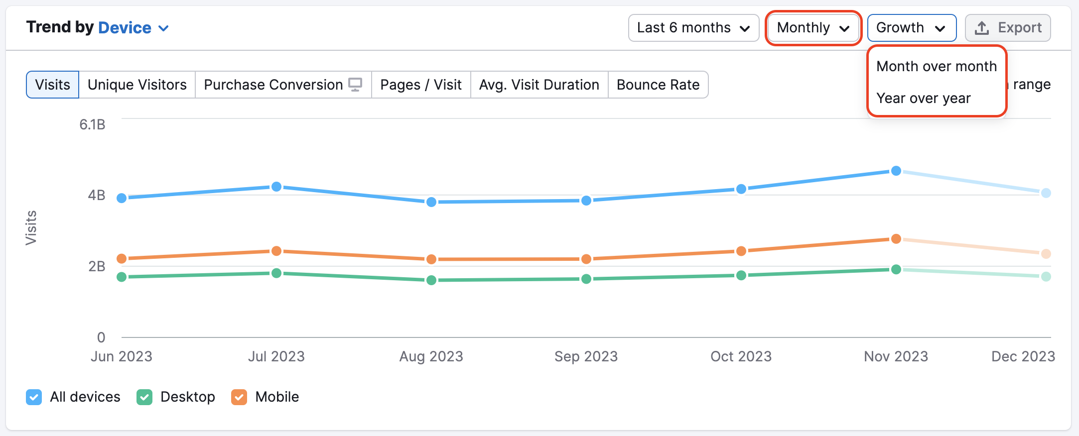
With this feature, it is easy to compare changes with the previous period for each metric and device
Also, Trend widgets provide daily and weekly data to analyze the impact of your competitors’ marketing campaigns or some news. Daily and weekly data is available for the last year.
You can download any graphs from the Trend widgets as a PNG, CSV, or Google Sheets by clicking the "Export" button.
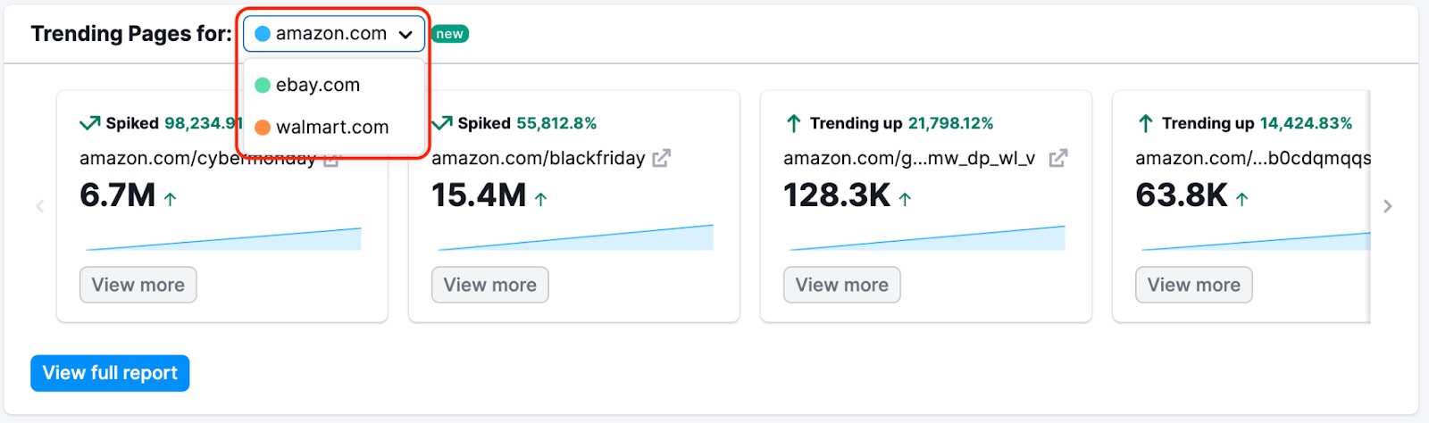
Next, you’ll find a widget that shows you the domain’s Trending Pages. The selector allows to show insights for each target domain in the competitors’ list.
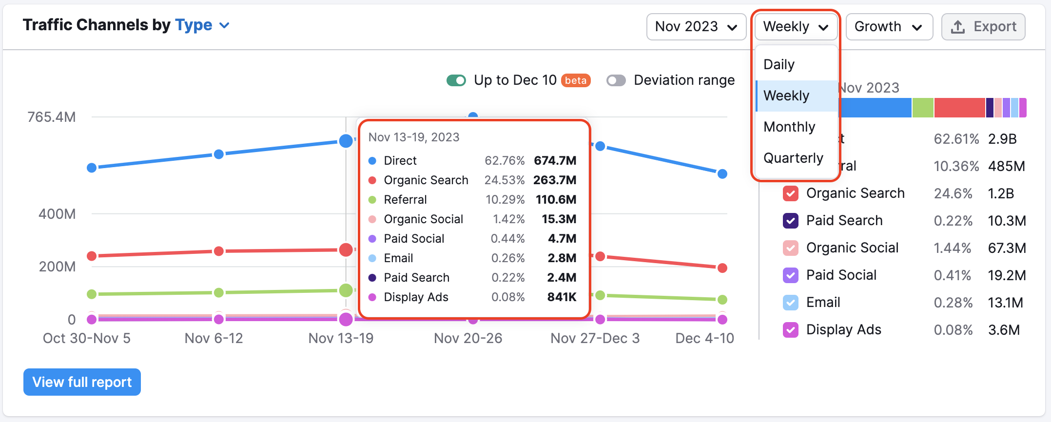
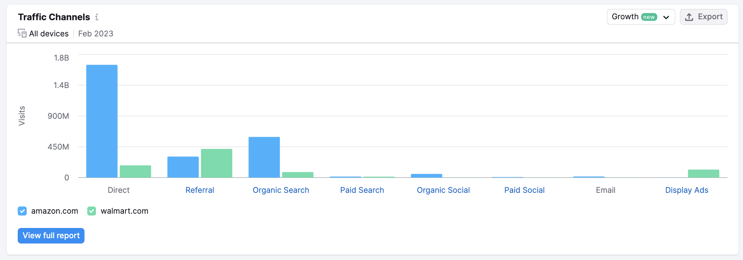
After that, you’ll find the Traffic Channels chart, which breaks down the share of traffic generated by eight source types: Direct, Referral, Organic Search, Paid Search, Organic Social, Paid Social, Email, and Display Ads.
If you are a .Trends user, you may also choose to view this data two ways: by Type or by Time Period.
Here is an explanation of what each source of traffic represents.
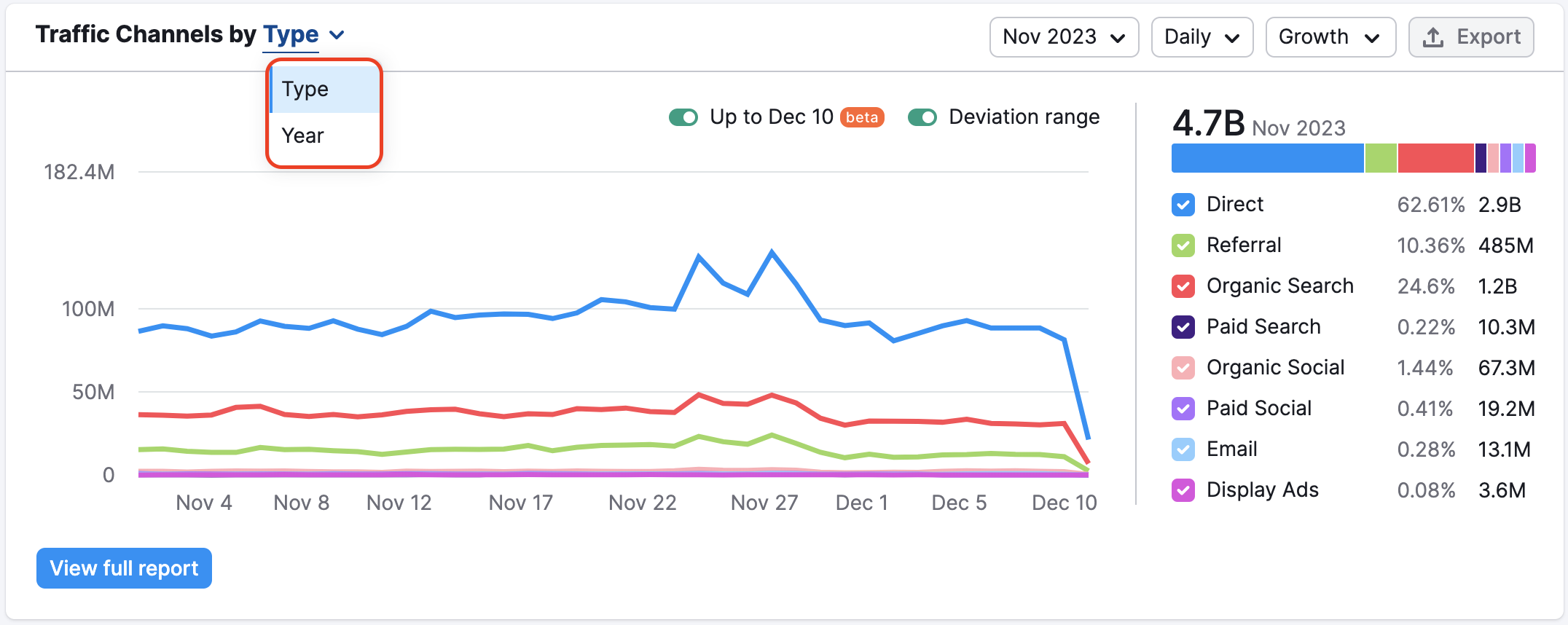
- Direct - traffic to a domain via URLs entered in a browser’s search bar, saved bookmarks, or links from outside a browser (such as PDFs or Microsoft Word documents).
- Referral - traffic to a domain from a hyperlink on another domain (as long as it is not a Social Media domain).
- Organic search– traffic to a domain directly from organic results on a SERP from a search engine such as Google, Bing, DuckDuckGo, etc.
- Paid search– traffic to a domain driven by text, PLA, local, or any other kind of paid advertisement on a SERP from a search engine such as Google, Bing, DuckDuckGo, etc.
- Organic social– traffic to a domain from links on social media websites like Facebook, Twitter, Reddit, Pinterest, YouTube, etc.
- Paid social– traffic to a domain from paid advertisements on social media websites like Facebook, Twitter, Reddit, Pinterest, YouTube, etc.
- Email– traffic to a domain via email services such as Gmail, Yahoo, iCloud, or domains with corporate email addresses.
- Display ads– traffic driven to a domain through a display or video ad supported by an advertising platform such as GDN or DoubleClick.
You can display data daily, weekly, or monthly. As seen in Traffic Trends, the Traffic Channels by Type graph displays both historical trends, indicated in a darker shade, and forecast of the current month’s anticipated performance, shown in lighter shades. Forecasts are based on the current month’s performance so far and are updated weekly.
You can also enable the deviation range and Growth chart in Traffic Channels with the same options as in the Trend widget – compare changes with the previous period for each traffic channel, and export the graphs as a PNG, CSV, or Google Sheets.
And it’s also possible to see daily and weekly data in the Traffic Channels widget.
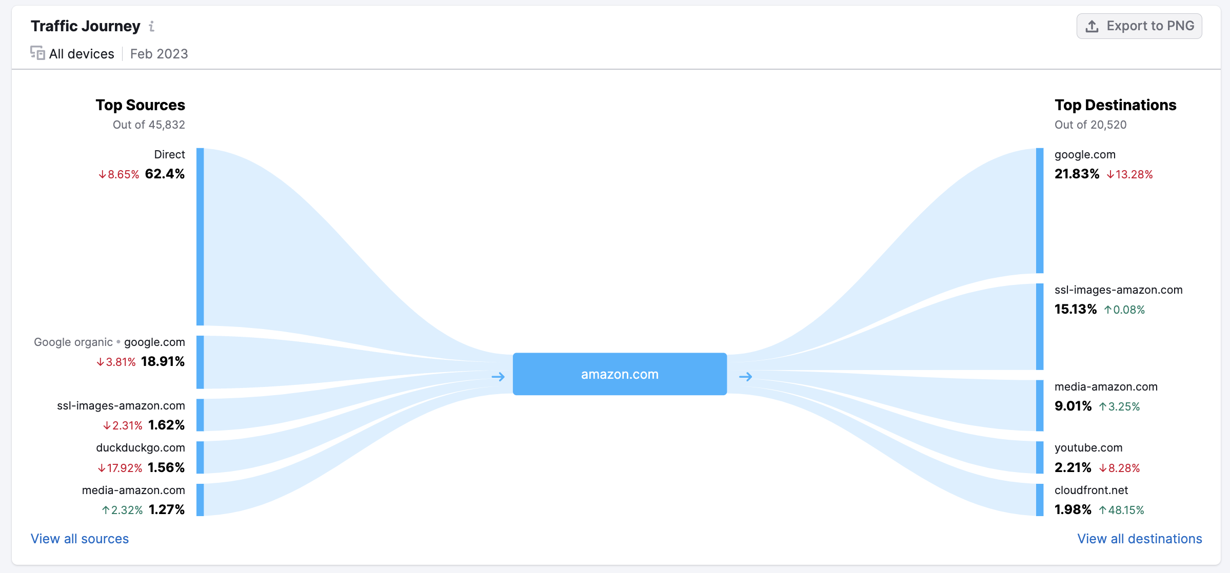
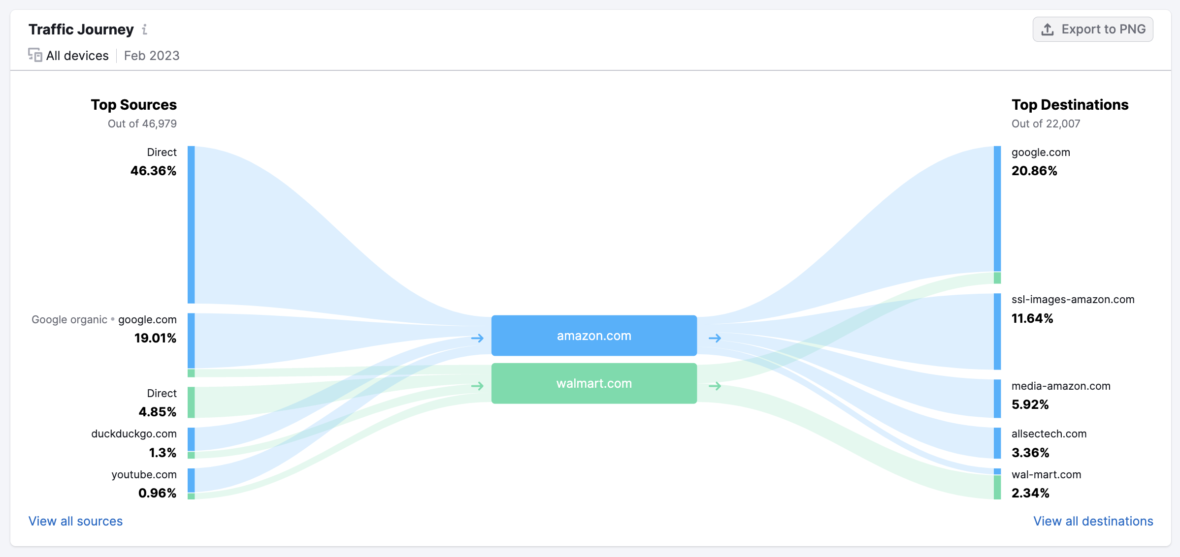
Below that, Traffic Journey allows you to identify the sources sending the most traffic to the analyzed domain, as well as the top 5 external domains that visitors most frequently go to after visiting the domain.
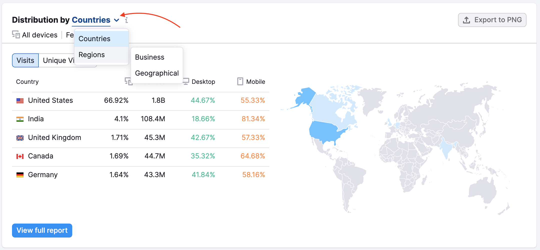
Next, Traffic Distribution shows you the countries and businesses or geographical regions that have the most users visiting the domain. Each country’s/region's ratio of mobile and desktop traffic will be listed beside its name. With the .Trends solution, you can view the full list in the Geo Distribution report and apply various filters.
Benchmark your website against competitors
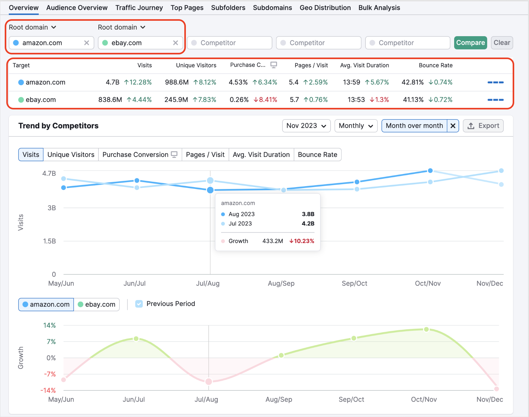
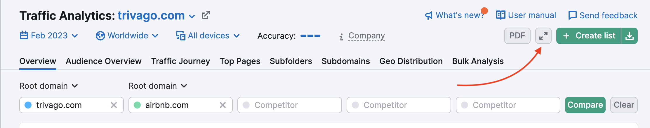
Traffic Analytics offers a number of great ways to benchmark the traffic statistics of multiple websites side by side. To compare multiple websites, simply enter the domain names into the search boxes at the top of the Overview report and click Compare.
If you have several domains you would like to check up on regularly, you can save them in a single list that you can access anytime. Reports in every tab will be adjusted to display the information for all domains from the list.
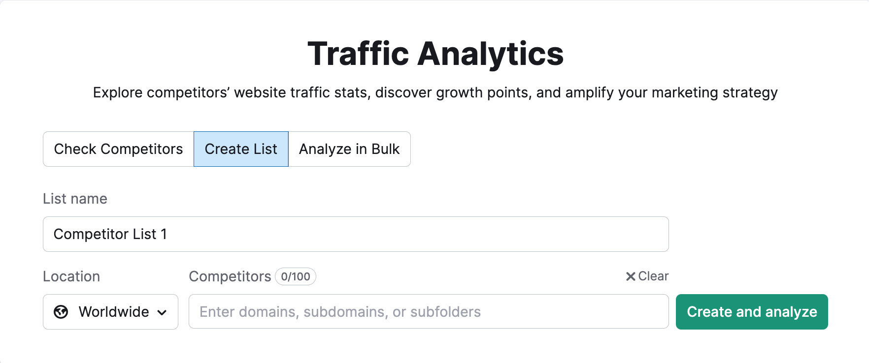
There are several ways to create a list:
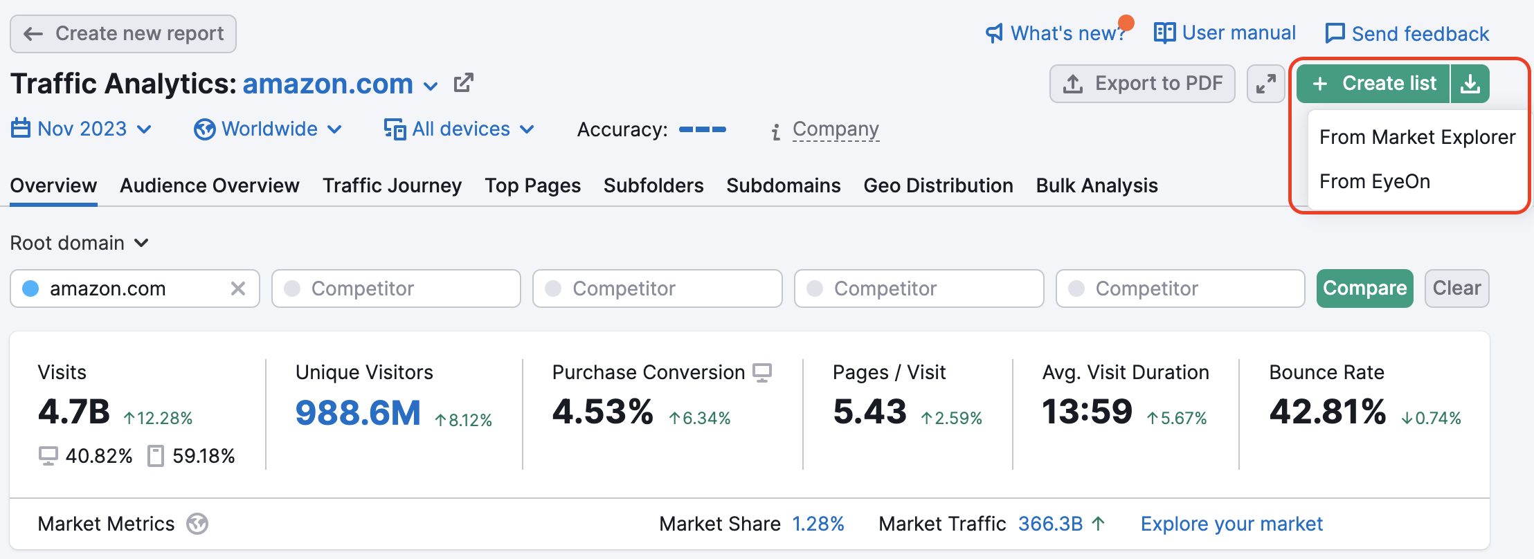
- Select “Create List” option on the Traffic Analytics starting page:
- Create a list after reviewing a domain on any of the Traffic Analytics tabs:
- Use a list from Market Explorer or EyeOn via the upload icon:
Apart from the root domains, you have an option to compare subdomains and subfolders in the Overview report.
Below you will see a comparison chart of the chosen domains and estimates of their visits, visitors, visit duration, bounce rate, etc. Each website will have a designated color representing them in the reports.
The line graph will plot a colored line for each website, with a darker shade showing the historical trends, and a lighter shade forecasting the domain’s performance. You can view data by day, week, or month. This chart can also be adjusted to visualize visits, unique visitors, purchase conversion, pages/visit, average visit duration, and bounce rate.
Below the line graph, you’ll see the Traffic Channels, Traffic Journey, and Geographic Distribution widgets estimating each website’s monthly traffic from each source.
The Traffic Channels widget compares the amount of traffic received by each website from each of the 8 Traffic Channels. Websites will be indicated by their assigned color and can be hidden from this comparison with the checkboxes beside their name. This comparison makes it easy to see how the chosen websites have different strengths and weaknesses in different channels.
You can change the analyzed month and year by applying the Historical Data filter at the top of the Overview report.
The Traffic Journey chart allows you to analyze traffic that comes through different sources over time to each of the domains you compare. It allows you to quickly assess which sources are generating the most traffic for each domain and compare the traffic distribution.
You can switch the graphs between device and time period using filters at the top of the report.
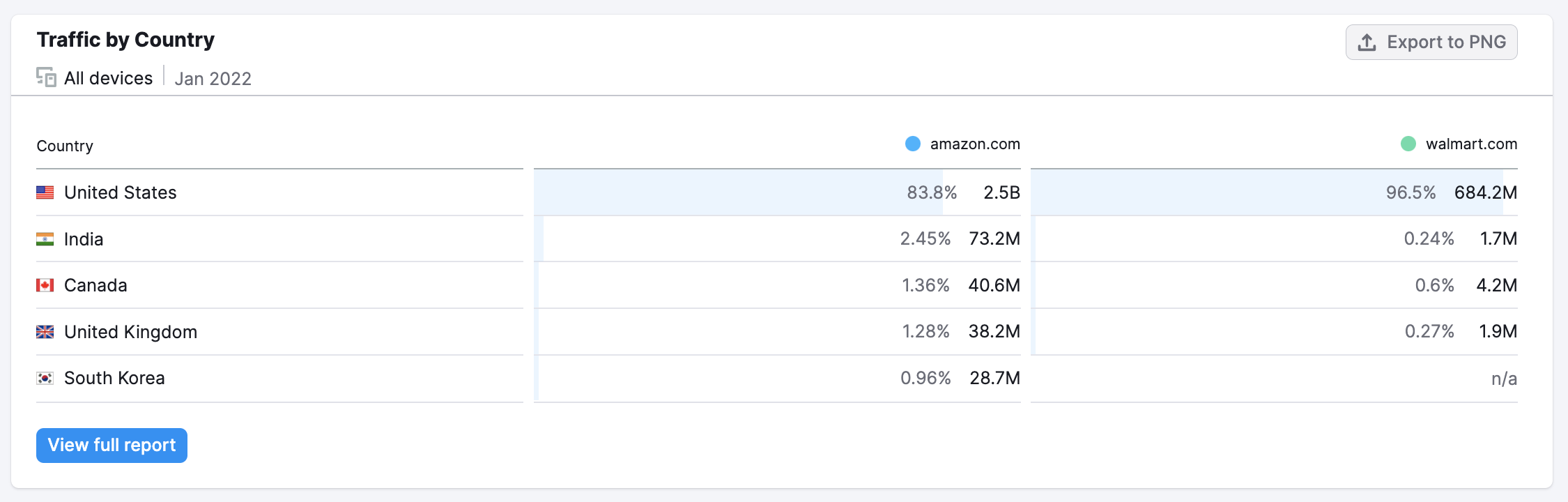
Finally, in the Traffic by Countries widget you will see the top 5 countries that send traffic to the main chosen website and how much traffic other websites in the comparison are estimated to receive from these countries as well. This can show you which websites are more popular in various regional markets and where competitors are outperforming each other. In the example below, notice the rivalry between bmw.com and mercedes-benz.com. Here you can apply the Historical Data filters as well.
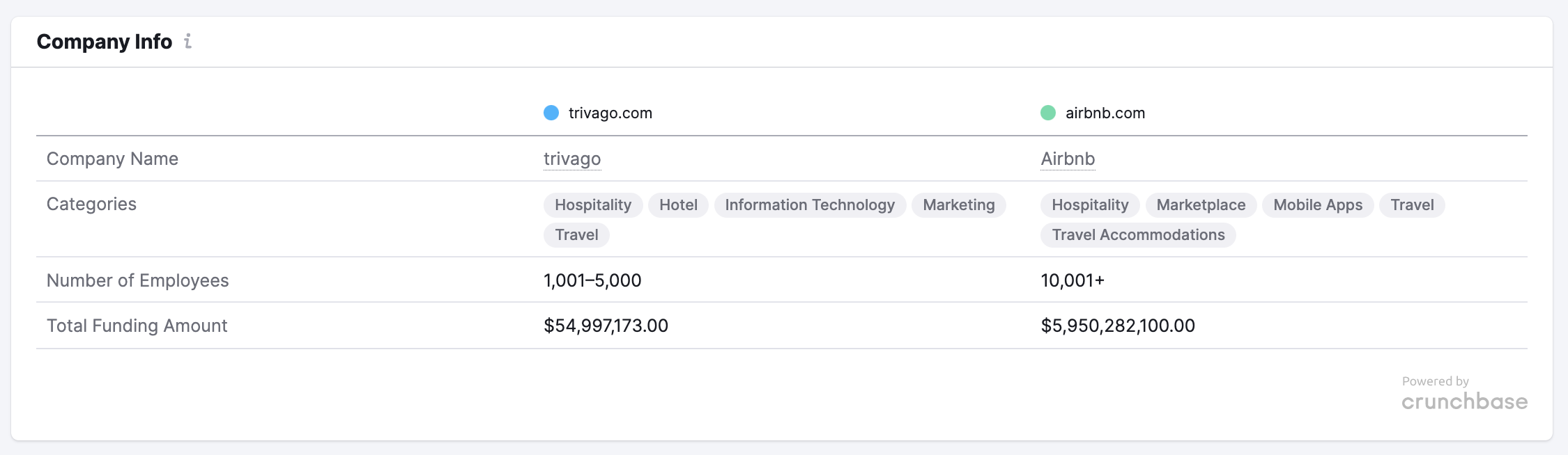
Company Info
At the very bottom of the overview report, you can find the company info. Here you will see data on the company’s industry, location, number of employees, amount of funding status, and the date it was founded. This information is powered by Crunchbase and is available to all paid users.
Pitch Mode
Pitch Mode is an optional view of Traffic Analytics that helps you to present Semrush Traffic Analytics data in a clean and easy manner. It’s useful for presenting to your prospects, customers, and colleagues when you do not want to distract them with irrelevant details like Semrush’s upper or left menu.
Pitch Mode will simplify the view on your device, removing the Semrush menus and hyperlinks so that there are no distractions. Use this mode to create a visually pleasing dashboard on a screen, or pitch your analysis to a business prospect or colleague.
To exit Pitch Mode, simply hit Esc on your keyboard.
PDF Reporting
You can export data from the Traffic Analytics Overview report to PDF format or craft a personalized report using the My Reports tool. Integrate information from Traffic Analytics, Semrush tools, Google Analytics 4, GSC, and additional sources to generate tailored PDF reports. Customize these reports to match your brand identity and set up automatic updates for effortless report automation.