Where would you start if you wanted to get an understanding of a website's content, especially large publishers?
I am usually interested in the following questions:
- How often and how much do they publish?
- Are there daily, weekly, monthly, or annual trends in their publishing activity?
- What topics do they write about, or what products do they sell?
- What are the trends in their topics? Which topics are gaining in volume, and which are not?
- How is the content or product split across languages, regions, categories, or authors?
In their most basic form, sitemaps are required to only have the “loc” tag (under the parent “url” tag).
Essentially, a sitemap is allowed to simply be a list of URLs. Other optional tags are allowed, most importantly:
- "lastmod",
- "changefreq",
- "priority",
- And, in some cases, "alternate".
If you have "lastmod" in the sitemap (and most reputable sites do), then you can get all the information related to publishing activity and trends. Then the richness of URLs determines how much information you can extract, but keep in mind that if the URLs are structured with no real information like example.com/product/12345, then you won't be able to get much from the sitemap.
The goal of this tutorial is to make sitemaps a little less boring!
I will be analyzing the sitemaps of BuzzFeed, and since they have "lastmod" as well as consistent and rich URLs, we will be able to answer all of the questions raised above.
This will be used as a proxy for "publishing date", which is not 100% accurate because pages get updated. In general, I have found that if things get changed, they tend to do so within a day or two to make some corrections, and the majority don't.
Python for Analysis
I will be using Python for the analysis, and an interactive version of the article is available here. I encourage you to check it out if you want to follow along. This way, you can make changes and explore other things that you might be curious about.
The data visualizations are also interactive, so you will be able to zoom, hover, and explore a little better. If you don't know any programming, you can safely ignore all the code snippets (which I will be explaining anyway).
So let's start.
To get the sitemaps in a table format, I will use the sitemap_to_df function from the advertools package. "df" is short for DataFrame, which is basically a data table.
You simply pass the URL of a sitemap (or a sitemap index URL) to the function, and it returns the sitemap(s) in tabular format. If you give it a sitemap index, then it will go through all the sub-sitemaps and extract the URLs and whatever other data is available. In addition to advertools, I will be using pandas for data manipulation, as well as plotly for data visualization.
 Retrieve sitemaps of BuzzFeed, and merge them into one DataFrame
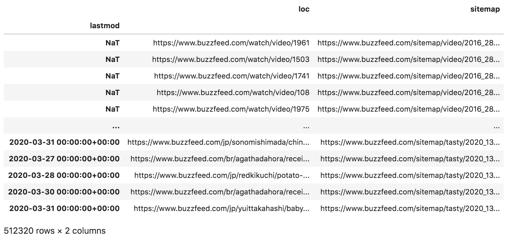 Sample rows from the "buzzfeed" DataFrame
The above is a small subset of our DataFrame — "lastmod" is the index, and we have two columns; "loc" which is the URLs, and "sitemap", which is the URL of the sitemap from which the URL was retrieved.
"NaT" stands for "not-a-time", which is the missing value representation of date/time objects. As you can see, we have around half a million URLs to go through.
Extracting Sitemap Categories
If you look at the URLs of the sitemaps, you will see that they contain the website category, for example:
https://www.buzzfeed.com/sitemap/buzzfeed/2019_5.xml
https://www.buzzfeed.com/sitemap/shopping/2018_13.xml
This can be helpful in understanding which category the URL falls under.
To extract the category from those URLs, the following line splits the XML URLs by the forward-slash character and takes the fifth element (index 4) of the resulting list. The extracted text will be assigned to a new column called sitemap_cat.
 Sitemap categories extracted and placed in a new column "sitemap_cat"
Now that we have a column showing the categories, we can count how many URLs they have and get an overview of the relative volume of content under each.
The following code simply counts the values in that column and formats the resulting DataFrame.
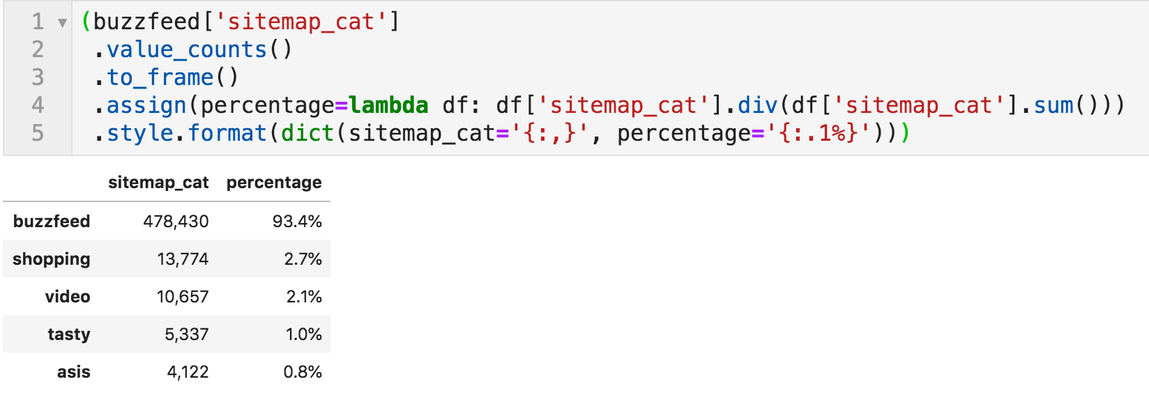 Number of articles per category, together with percentages
It is clear the "buzzfeed" is the major category, which is basically the main site, and the others are very small in comparison.
Before proceeding further, it is important to get a better understanding of the NaT values that we saw at the beginning. Let's see what category they fall under.
 Categories where "lastmod" is not available (first five)
The first five falls under "video", but is that true for all the missing values?
The following line takes a subset of the DataFrame Buzzfeed (the subset where the index contains missing values), then takes the sitemap_cat column, and counts the number of unique values. Since we saw that some values are "video", if the number of unique values is one, then all categories of missing dates fall under "video".
 Number of unique categories where "lastmod" is not available
We have now uncovered a limitation in our dataset, which we know affects 2.1% of the URLs.
We can't know what percentage of traffic and/or revenue they represent, though. We will not be able to analyze date-related issues with the video URLs. Nor will we be able to get any information about the content of those URLs for that matter:
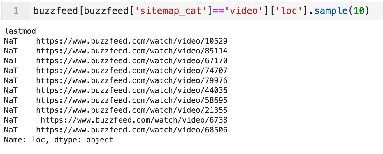 Sample of video URLs
Publishing Trends
Let's now check how many articles they publish per year, and whether or not there were higher/lower publication years.
The following code resamples the DataFrame by "A" (for annual) and counts the rows for each year. It is basically a pivot table if you are more familiar with spreadsheets.
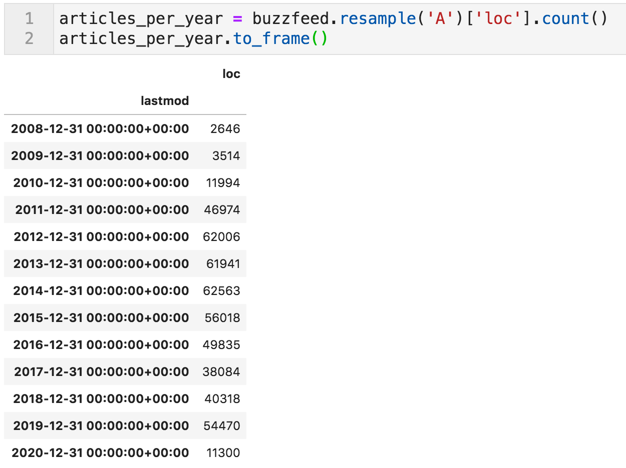 Articles per year
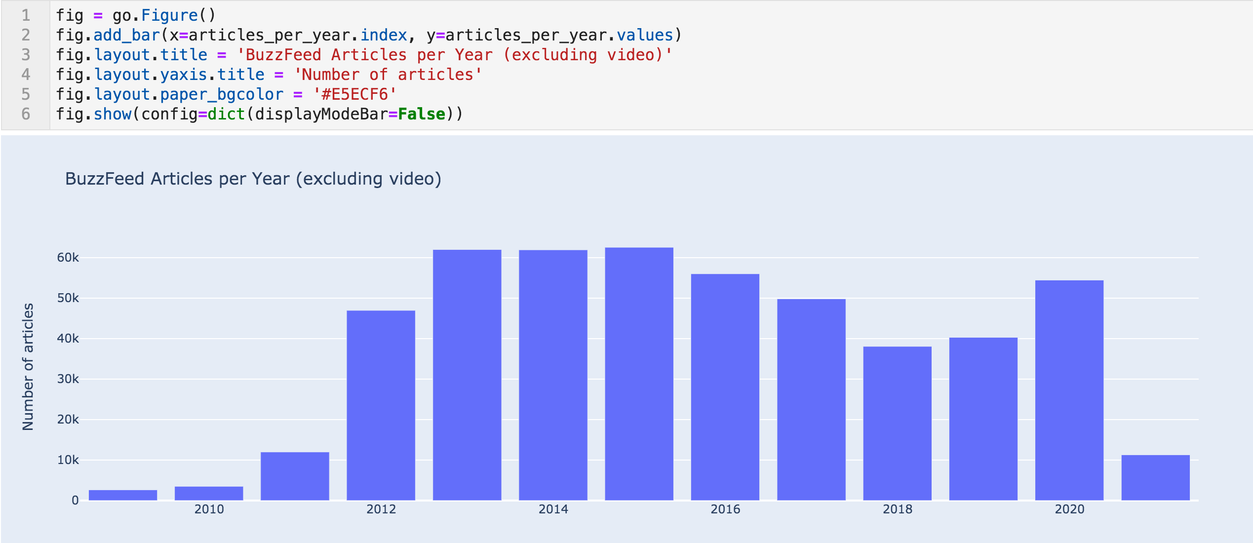 Articles per year bar chart
We can see dramatic increases in articles from 2010 (3,514) to 2011 (12k), and from 2011 to 2012 (46k).
It is highly unlikely that a website can increase it is publishing activity almost fourfold, twice, and in two consecutive years. They might have made some acquisitions, content partnerships, or maybe there are issues with the dataset.
Monthly Trends
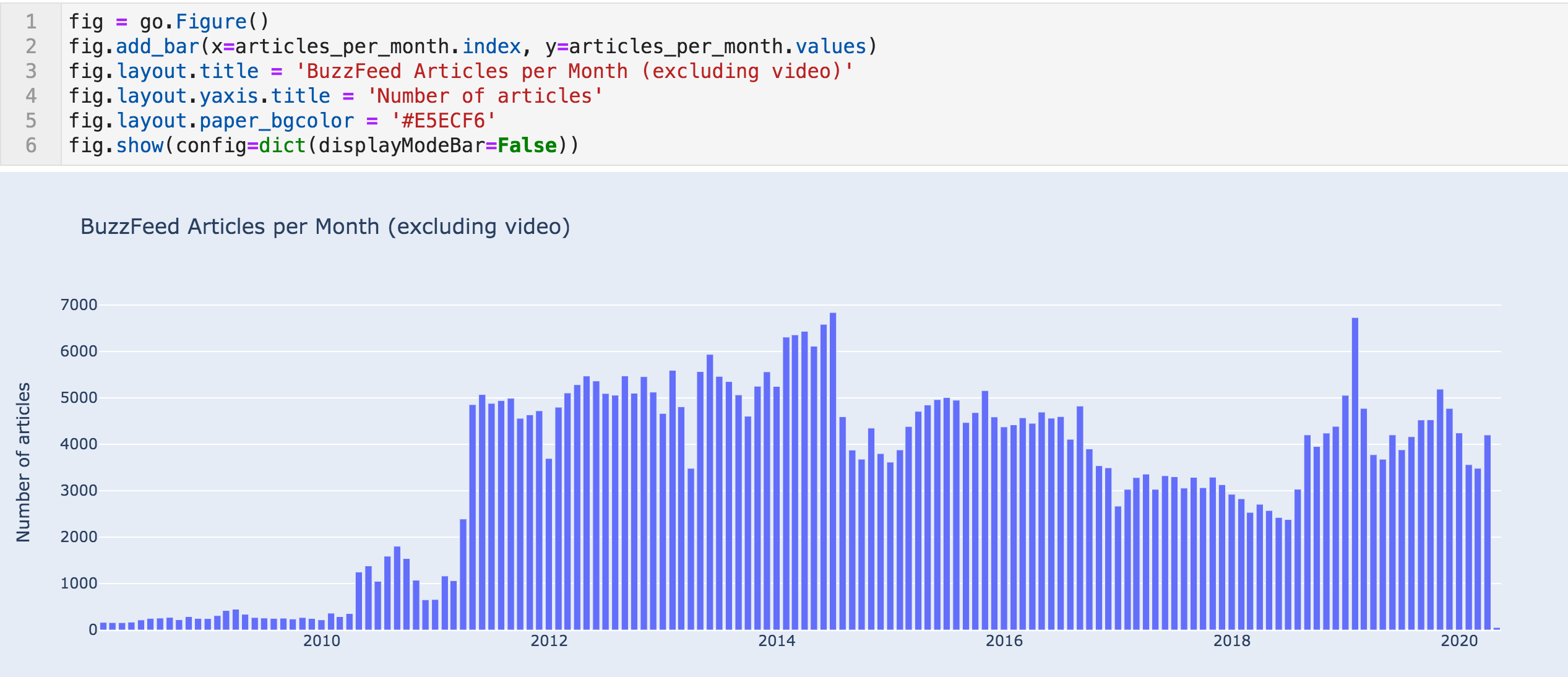
When we check the authors later, we will see a possible answer to this sudden increase. Let's zoom in further, and look at the monthly trend.
 Articles per month sample
 Articles per month bar chart
This data confirms the trend above and shows an even more sudden change.
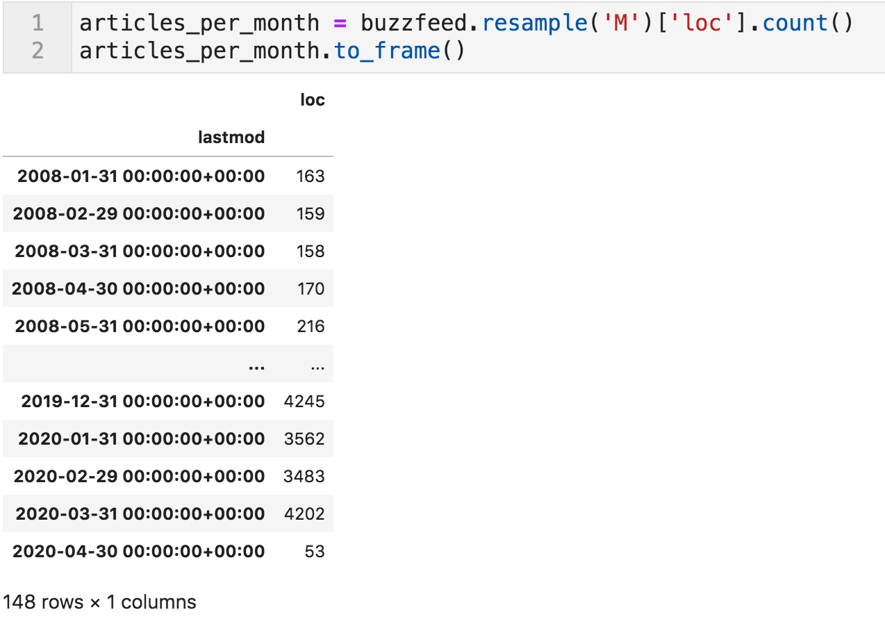
In April 2010, they published 1,249 articles, after having published 354 the previous month. We can see something similar happening in April of 2011. Now it is almost certain that this is not an organic natural growth in their publishing activity.
Weekly Trends
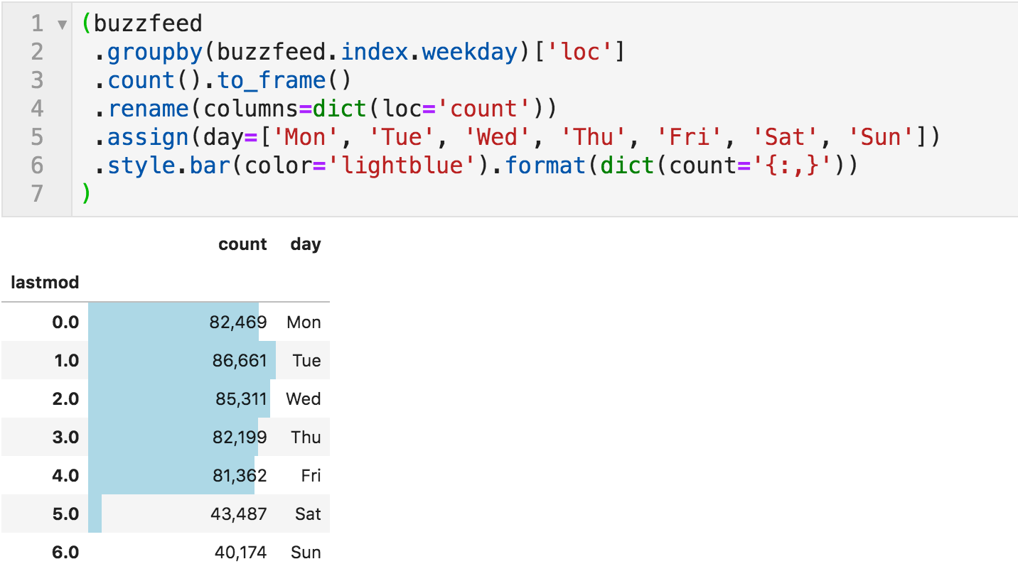
We can also take a look at the trend by day of the week.
 Articles published by day-of-week
Nothing very surprising here. They produce a fairly consistent number of articles on weekdays, which is almost double what they produce on weekends. You can run this for different time periods to see if there are any changes across years or months, for example.
Annual Trends in Categories
We can also take a look at the annual trends by category and see if something pops out. The following code goes through all categories and creates a plot for the number of articles per year.
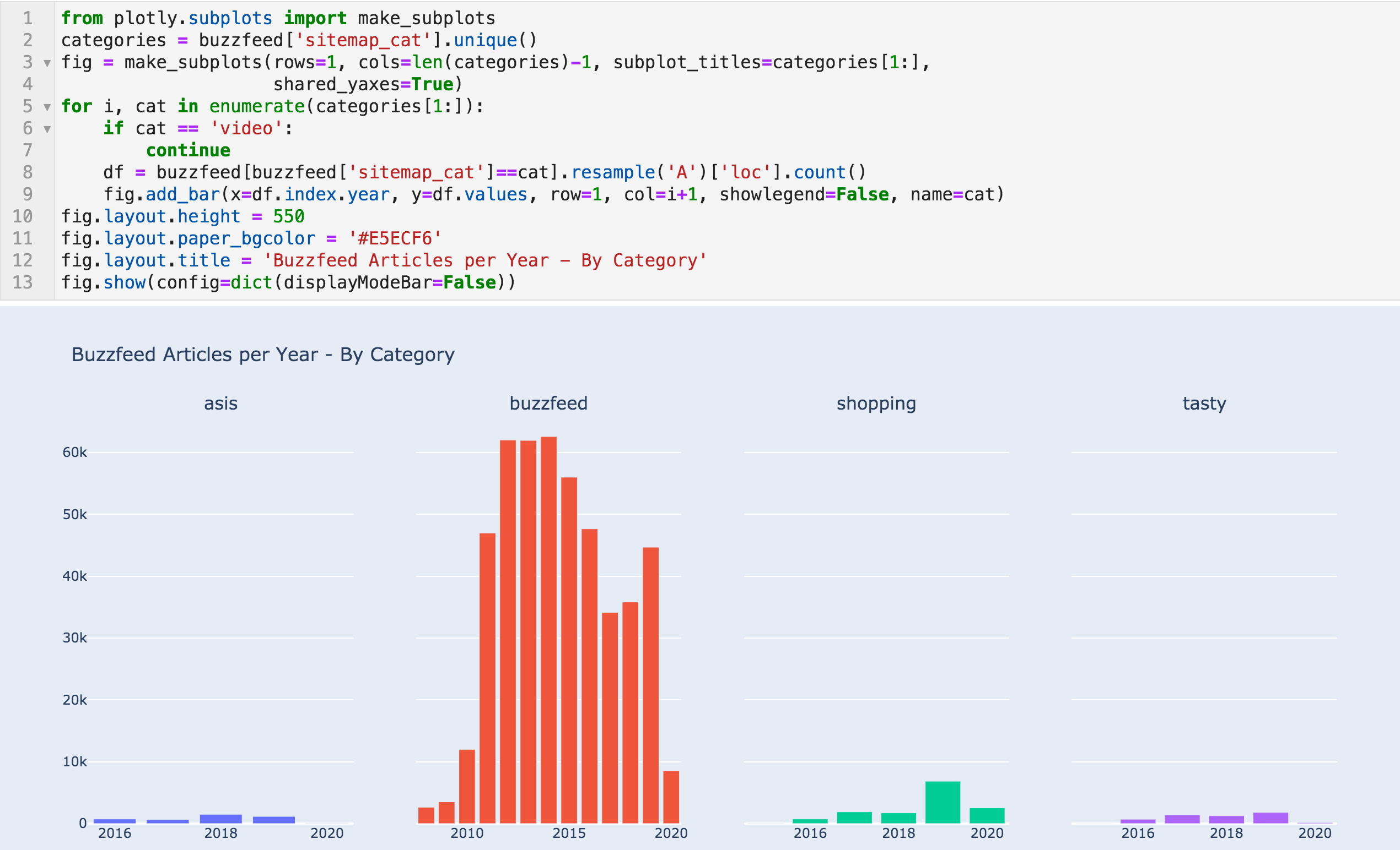 Yearly articles by category
I can see two things here. First is the jump in "shopping" articles from 1,732 to 6,845 in 2019, and 2020 is on track to top that. It seems that it is working well for them. Checking some of those articles, you can see that they are running affiliate programs and promoting some products.
Second is how misleading this chart can be. For example, Tasty has been acquired relatively recently by BuzzFeed, and here you can see it occupying a tiny portion of the content. But if you check their Facebook page, you will see that they have almost one hundred million followers. So keep this in mind, be skeptical, and try to verify the information from other sources where possible.
URL Structure
We can now move to analyze whatever information we can get from the URLs, and here is a random sample:
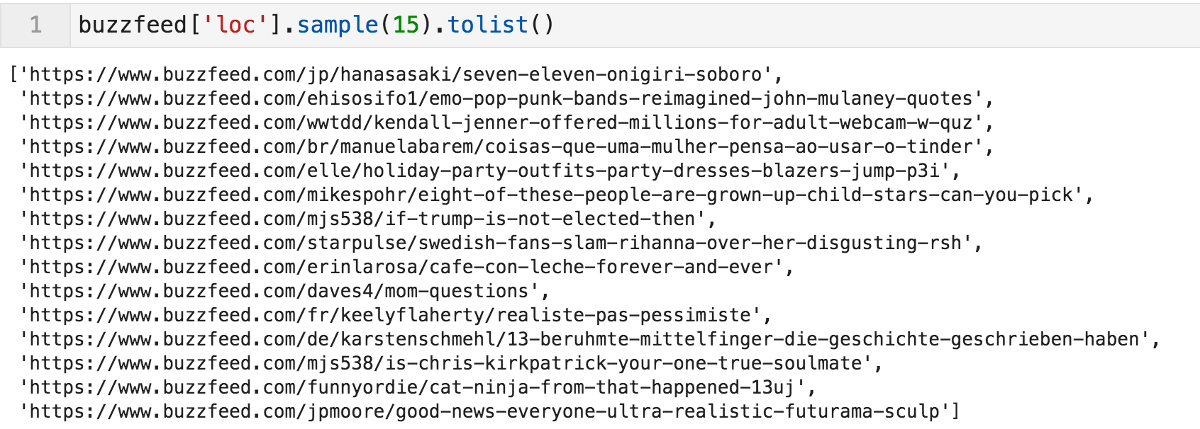 Random sample of URLs
The general template seems to be in the form buzzfeed.com/{language}/{author}/{article-title}, and the English articles don't have "/en/" in them.
Let's now create a new column for languages, which can be done by extracting the pattern of any two letters occurring between two slashes. If nothing is available, it will be filled with "en". Now we can see the number of articles per language (or country in some cases).
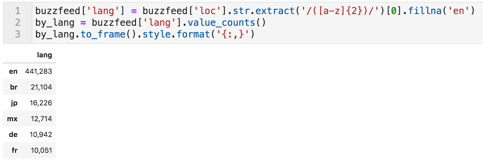 Number of articles per language
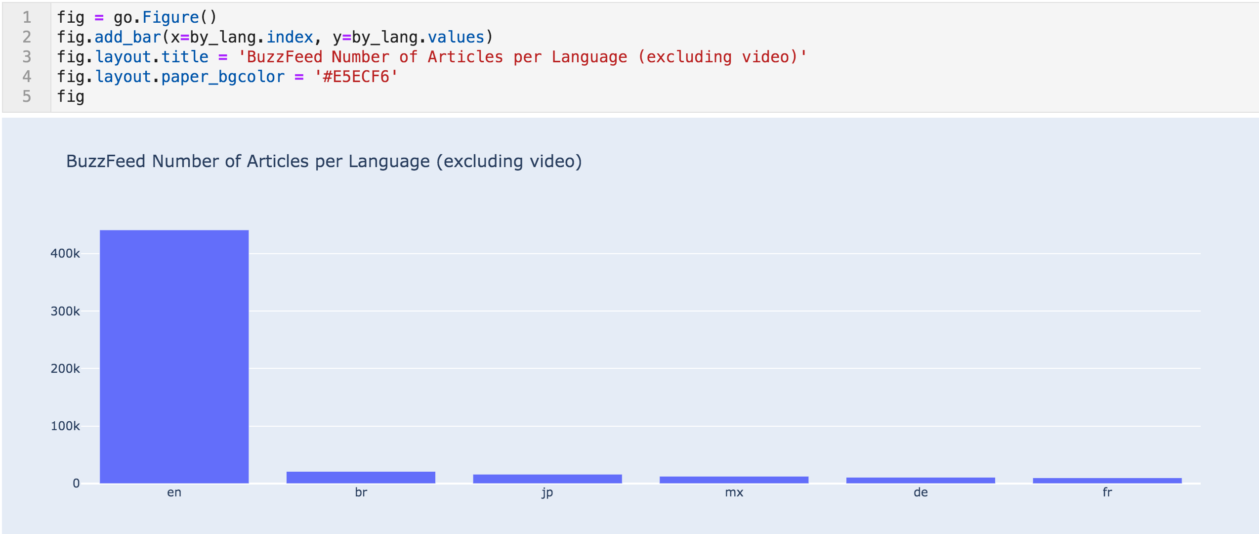 Articles per language bar chart
We can also see the monthly number of articles per language for a better view.
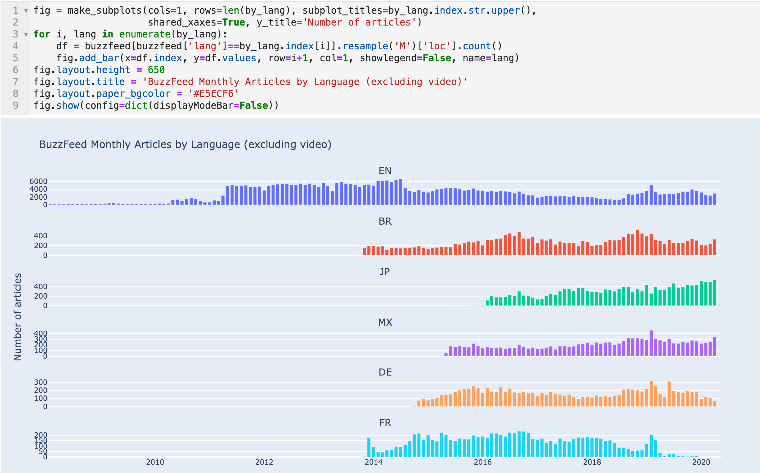 Number of articles per month - by language
Extracting Data on Authors
Now let's go through the same process for authors. As before, we split the "loc" column by "/" and extract the second to last element, and place it in a new "author" column. After that, we can count the articles by author.
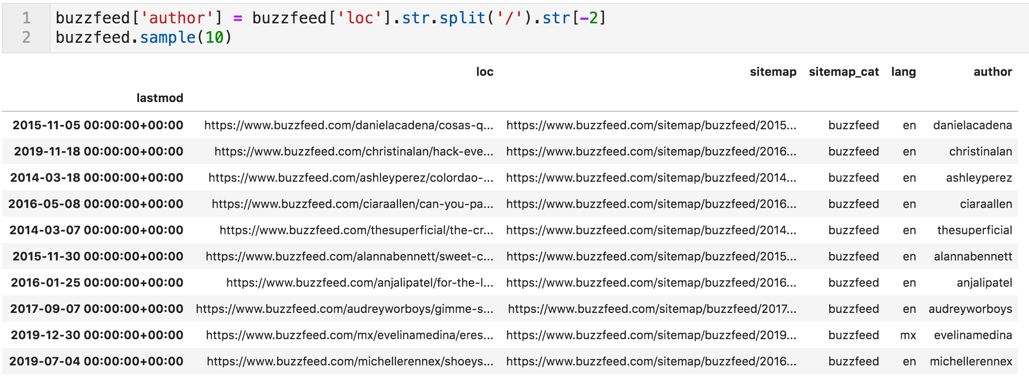 New column added "author"
 Code to count and format the number of articles per author
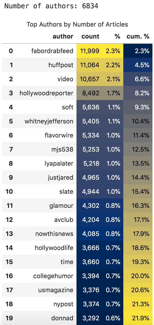 Number of articles per author (all time)
"cum. %" shows the cumulative percentage of the number of articles by the authors up to the current row.
The first three authors generated 6.6% of the total articles, for example (of course, "video" is not an author, so we will ignore it). You can also see that some of the top authors are actually other news organizations and not people.
I manually checked a few articles by "huffpost", and got a 404 error. The following code snippet goes through a random sample of URLs where the author is "huffpost", and prints the URL along with the response.
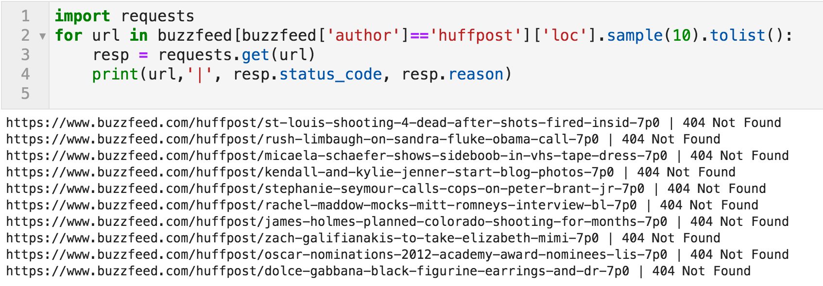 Random sample of URLs and their responses
And this is another issue in the dataset.
The articles of the top contributors don't exist anymore. I didn't check them all, and the proper way is to go through all of the half-a-million URLs to quantify this issue.
The existence of such a large number of articles by large news organizations might be the answer to the question of the sudden increase in the volume of content on BuzzFeed.
It is definitely a problem to have 404's in your sitemap, but in our case, it is great that they didn't remove them, because we have a better view of the history of the site, even though many URLs don't exist anymore. This also means that there might be other non-existent URLs that were removed, and we don't know about. Did I say skeptical?
With such a large website, you can expect some issues, especially going back seven or eight years, where many things change, and many things are not relevant anymore. So let's do the same exercise for a more recent period, the years 2019 and 2020 (first quarter).
 Code to count articles per author for 2019 - 2020 Q1
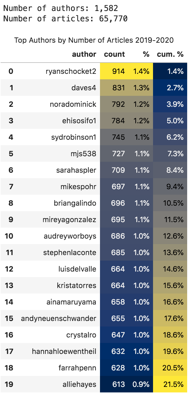 Top authors by number of articles for 2019 - 2020 Q1
Now all the top authors seem to be people and not organizations.
We can also see that the top twenty produced 21.5% of the content in this period. And we can see how many articles each author produced, as well as the percentage of that number out of the total articles for the period.
In case you were wondering how many articles per month, each author produced:
 Code to produce monthly articles per author
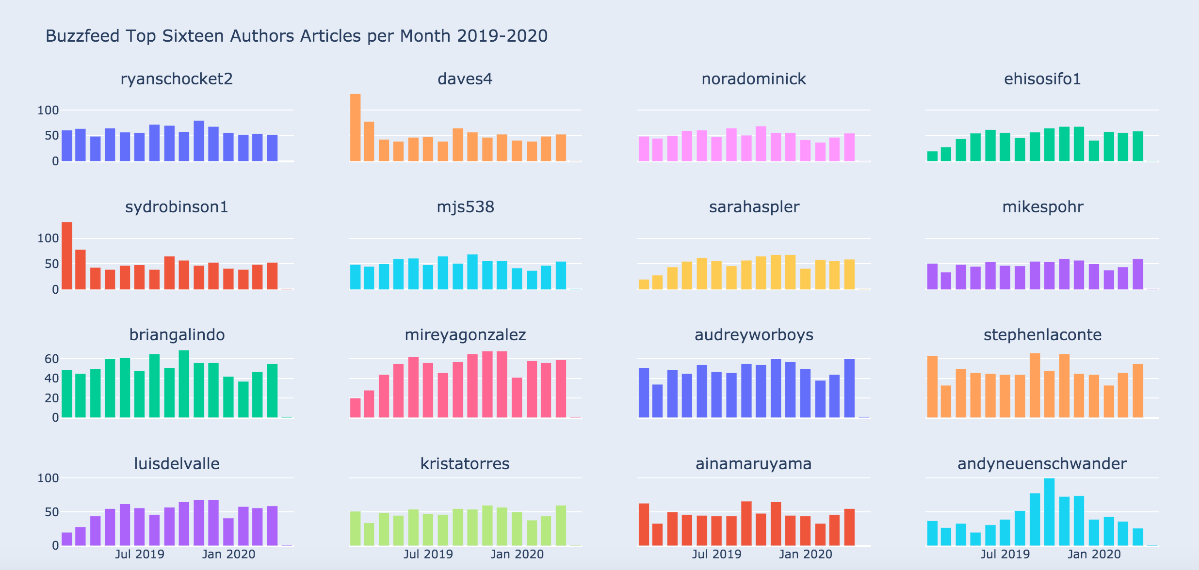 Articles per month by author
A Top-down Approach
The above was an exploratory approach, where we didn't know anything about the authors. Now that we know a little, we can use a top-down approach.
The following function takes an arbitrary number of author names and plots the monthly number of articles for each, so you can compare any two or more authors. So let's start with the top news organizations.
 Function to plot and compare authors' publishing activity (articles per month)
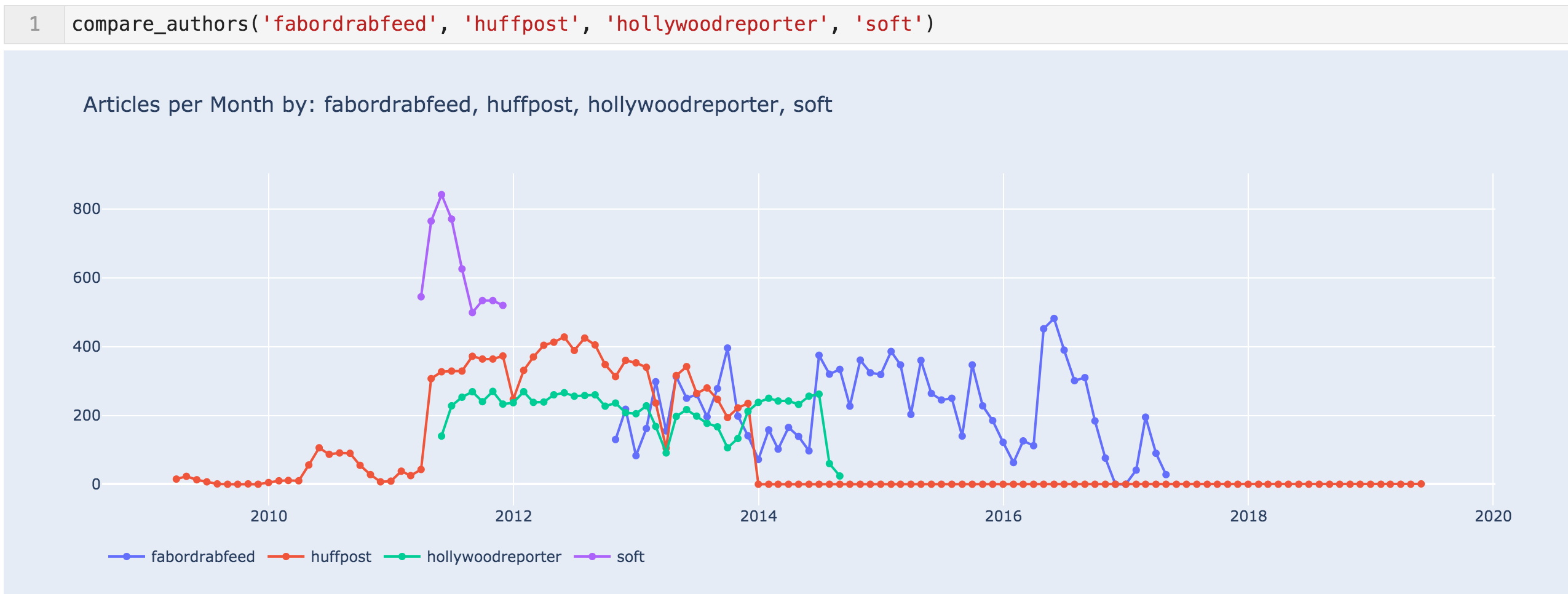 Articles per month for 'fabordrabfeed', 'huffpost', 'hollywoodreporter', & 'soft'
With all of the data, it seems more likely that the jump in articles in April 2011 was due to content partnerships. We can also see that the partnership with HuffingtonPost was ended in November of 2013, according to the sitemap at least.
Below are the trends for the top three authors in the last five quarters.
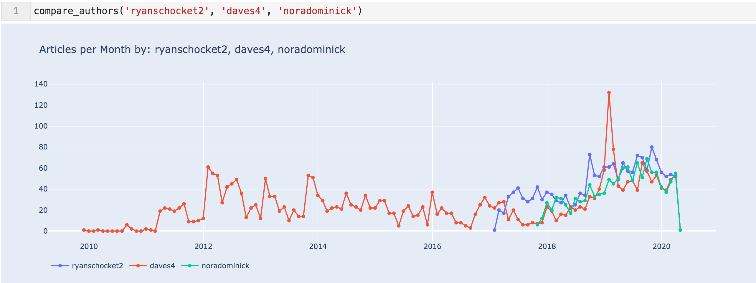 Articles per month for 'ryanschocket2', 'daves4', & 'noradominick'
Content Analysis
We now get to the final part of the URL — the slug that contains the titles of the articles. Everything up to this point was basically creating metadata by categorizing the content by date, category, language, and author.
The slugs can also be extracted into their own column using the same approach. I also replaced the dashes with spaces to more easily split and analyze.
 New column added "slugs"
To take a look at the slugs, I created a subset of them containing only English articles.
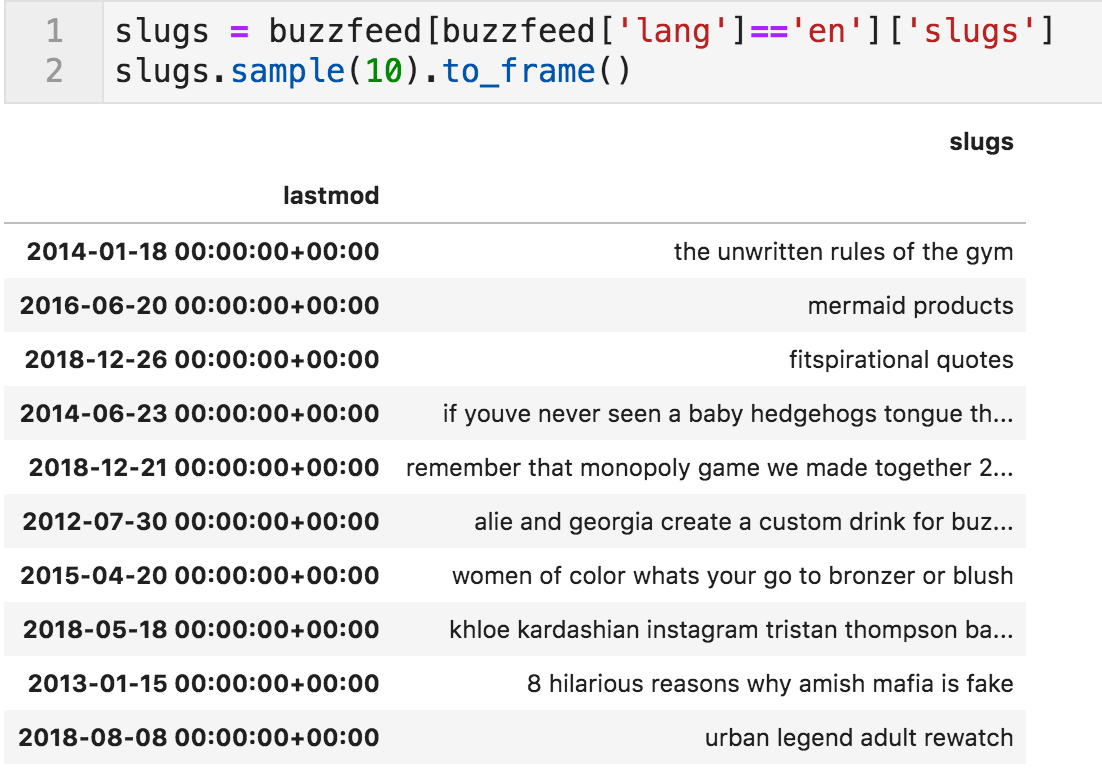 Random sample of article slugs
The 'word_frequency' Function
The simplest thing to do is to count the words in the slugs. The word_frequency function does that for us.
Please note that this function removes stopwords by default, which is available is a set to explore. In many cases, you might want to edit this list because what might be a stopword in a certain context, is not in another.
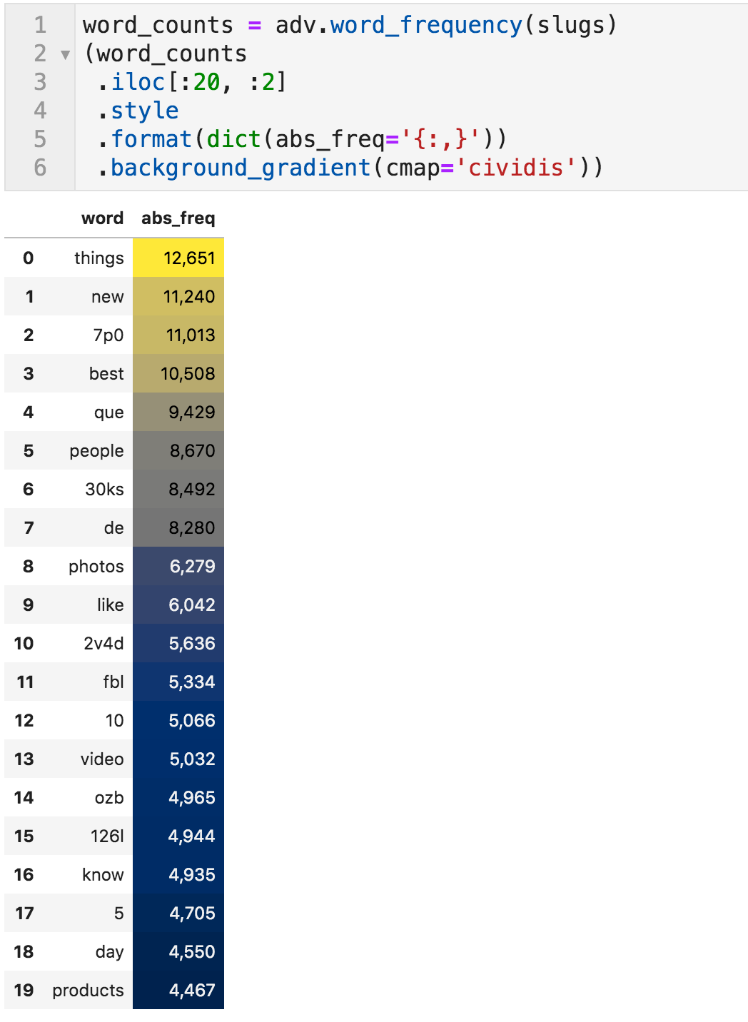 Most-frequently used words in article titles
If one word is not conveying much information, we can specify the phrase_len value as 2 to count the two-word phrases (tokens is another name for that).
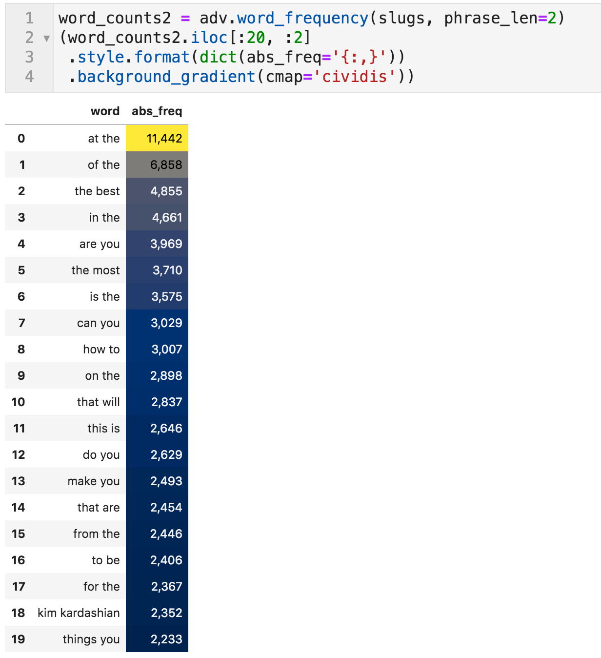 Most frequently used two-word phrases
Topics to be Analyzed
Just like we compared the authors, we can use the same approach by creating a similar function for words, which will serve as topics to be analyzed.
 Function to compare the appearance of selected words across time
These are the three most frequently appearing names of celebrities, and "quiz" also seems popular, so I compared them to each other.
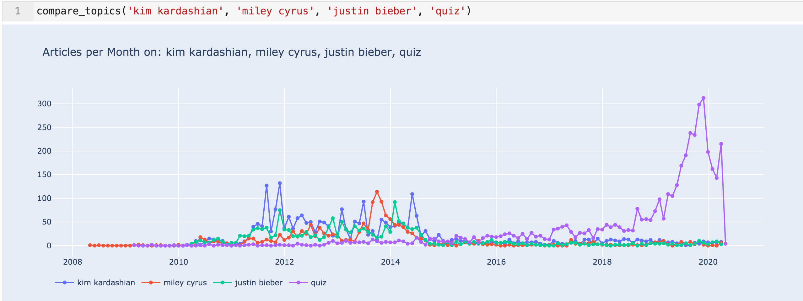 Articles per month for 'kim kardashian', 'miley cyrus', 'justin bieber', & 'quiz'
This data shows that probably the content HuffingtonPost and the others were publishing was celebrity heavy. It also shows how popular quizzes have been, and the massive focus they are giving to them.
This raises the question of what those quizzes are about. To do that, we can take a subset of the slugs, where the word "quiz" is present, and count the words in those slugs only. This way, we can tell what topics they are using for their quizzes.
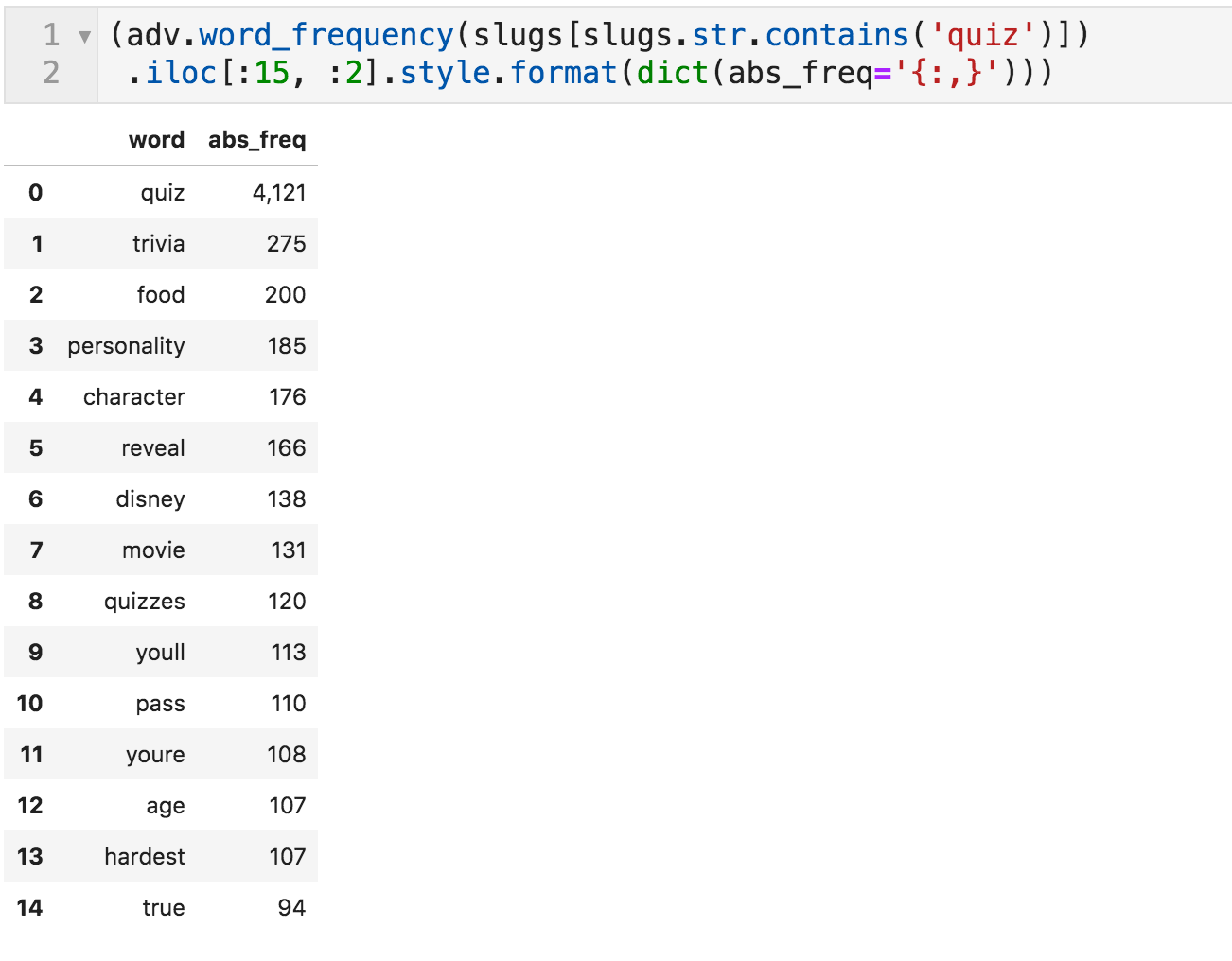 Words most frequently appearing with "quiz"
And now, you can start analyzing!
Summary
We now have a good overview of the size and structure of the dataset, and we spotted a few issues in the data. To better structure it, we created a few columns so we can more easily aggregate by language, category, author, date, and finally, the titles of articles.
Obviously, you don't get the full view on the website by the sitemaps alone, but they provide a very fast way to get a lot of information on publishing activity and content, as seen above. The way we dealt with "lastmod" is pretty standard (many sites also provide the time of publishing and not just the date), but the URLs are different for every site.
After this preparation and getting familiar with some of the possible pitfalls you may face, you can now start a proper analysis of the content. Some ideas you might want to explore: topic modeling, word co-occurrence, entity extraction, document clustering, and doing these for different time ranges and for any of the other available parameters we created.