
Over 30 million websites use Google Analytics. Many of us spend time using the tool every single day. But, did you know there are powerful built-in reporting features and regularly appearing new features you may have missed?
Being aware of all the helpful features at your fingertips could make your work more efficient, and help you find opportunities to dig deeper into your data. (And, it won’t hurt to show your boss what you can do either!)
I will cover 5 potentially unknown features in Google Analytics, how to use them, examples, and my personal opinion on their limitations. This won’t be a completely comprehensive post but is meant to open the door for discussion or potential use cases.
Most of these require common knowledge of dimensions and metrics in analytics. Take the time to learn about these in the Google Analytics training materials if you need a refresher.
If you have any comments, questions, or if there is anything I have missed, please leave a note in the comment section below.
HiddenFeature#1:SortType
Purpose
Sort Type’s best purpose is finding top growth, or drop-offs, in metrics on specific pages, devices, campaigns, sources or other dimensions.
WhereItIsFound
At the top of the traditional tables features within most audience, acquisition, and behavior reports.

HowtoUse
The default sort feature sorts highest to lowest, or lowest to highest if you double click, based on which column you have selected.
If you select the Sort Type drop-down, you can switch to Absolute Change or Weighted Change.
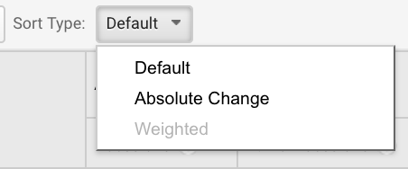
Absolute change will sort your data by the total amount of change instead of the percentage. This is great to see what actually grew the most within the platform, instead of what is the highest percentage of growth.
Weighted Change only applies to bounce rate. This will change the sort to automatically display the rows with the most statistically significant bounce rates to the top. This is great to rule out bounce rate outliers, and dig into what pages truly matter the most.
ExampleofUse
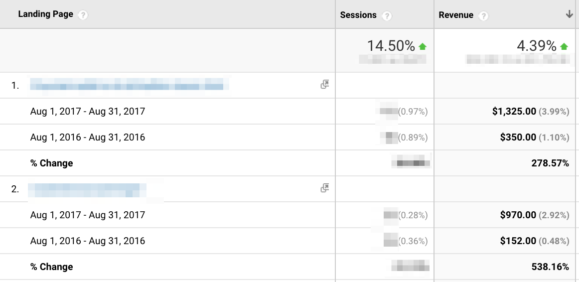
Say you want to find the top three organic landing pages by largest revenue growth year over year to identify what is contributing to your organic revenue growth. Take these steps:
- Navigate to Acquisition > All Traffic > Channels > Organic Search > Landing Pages
- Update comparison date range to desired dates
- Sort by Revenue Highest to Lowest
- Change Sort Type to Absolute Change
Limitations
- Weighted sort is only available for bounce rate.
- There is no ability to sort by percentage change.
HiddenFeature#2:PlotRows
Purpose
The best purpose for using Plot Rows is to quickly visualize time series data for selected dimensions, without filtering or exporting to a data visualization tool.
WhereItIsFound
At the top of the traditional tables features within most audience, acquisition, and behavior reports.

HowtoUse
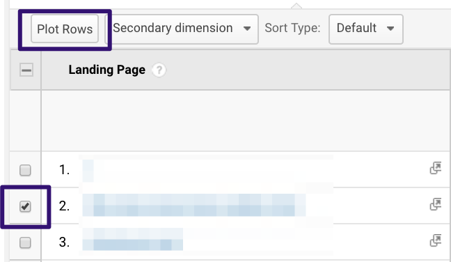
Plot Rows gives you the ability to select specific rows within the data and plot them on the top time-series chart as their own data series.
Select desired rows then click Plot Rows:
Your result will look something like this.
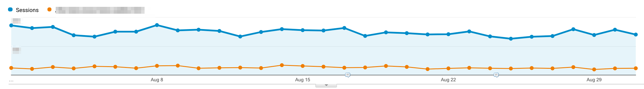
Note that selecting two rows to plot will result in two lines instead of one combined line.
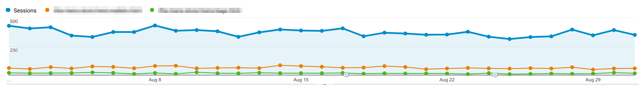
Change the chart data type by selecting desired metrics at the top of the chart.
Tip: You can export this data into Excel and build a better-looking chart to improve your deliverables and reports.
ExampleofUse
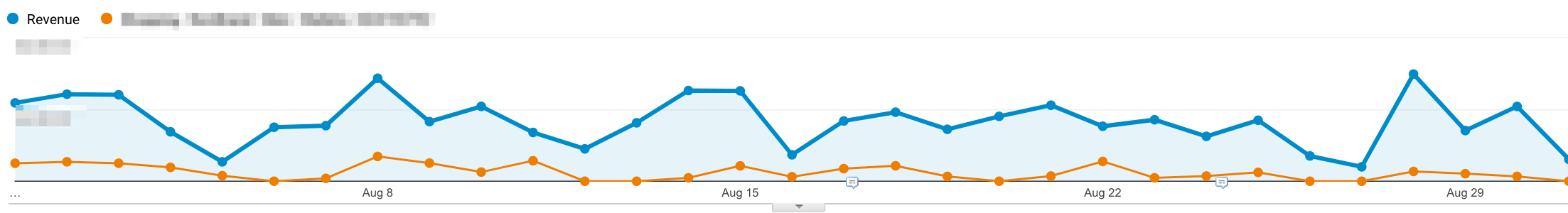
You are pulling a report for a client, and want to see what trends they have experienced throughout the year for a specific shopping campaign revenue versus total revenue.
- Navigate to Acquisition > Campaigns
- Select Desired Campaign
- Select Plot Rows
- Change Chart Data Type to Revenue
Limitations
- Plotting rows keeps the total sessions on the chart instead of creating a new chart with only the data selected. Sometimes selecting a specific dimension value offers much better visuals than the Plot Rows feature
- I would love to see a built-in functionality to select two rows and show the combined value in the chart instead of multiple lines. For now, I will stick to writing regex to create those charts.
HiddenFeature#3:TermClouds
Purpose
You have probably heard of word clouds, but did you know Google Analytics has a built-in functionality called Term Clouds?
This feature takes your current dimension values for a selected metrics and turns them into a word cloud.
It is best used for visualizing top keywords in an AdWords campaign, or keywords from Google Search Console, based on key metrics. This works with other dimensions but is not quite as useful as keywords.
Whereit’sFound
You can find Term Clouds at the top of the traditional tables features within most acquisition reports.

HowtoUse
Go to the keyword report for either AdWords or organic - organic can be either in the channel report or in the Google Search Console report.
Select the term cloud report and adjust to show more rows and increase date ranges to give the term cloud more data. Change the report metrics if you would like.
Regular and advanced filtering down will help dig into specific data and adjust the cloud as needed.
ExampleofUse
You are auditing AdWords performance for a specific product campaign over the last 90 days. You want to identify top revenue terms and visualize them for the rest of your marketing team.
- Navigate to Acquisition > Adwords > Campaigns > Select Campaign > Change Primary Dimension to Keywords
- Adjust date range to Last 90 Days
- Increase rows to the Max Allowed
- Change metric to Revenue

Limitations
- There are not options for customization of colors. Look for other word cloud tools if you want more customization.
- Term Clouds are not available in site search or behavior reports such as geographic areas or languages. These are missed opportunities to visualize this type of data.
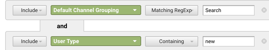
HiddenFeature#4:SecondaryDimensions
Purpose
Use Secondary Dimensions to dig into your metrics with two dimensions instead of one.
Secondary dimensions are an added layer to the primary dimension. Think of these as a way to ask one more question of the data.
Say you already have your top source report, and know that organic is the top source, but want to know what age range is driving most organic, start by using a secondary dimension of age.
WhereItIsFound
Below the list of primary dimensions within the report view.

HowtoUse
Secondary dimensions are relatively easy to add once you understand how they work. Each report in Google Analytics uses a primary dimension. The primary dimension will change based on what report you are in.
Simply navigate to the secondary dimension drop down and select your desired second dimension to add to the report.
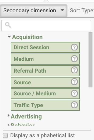
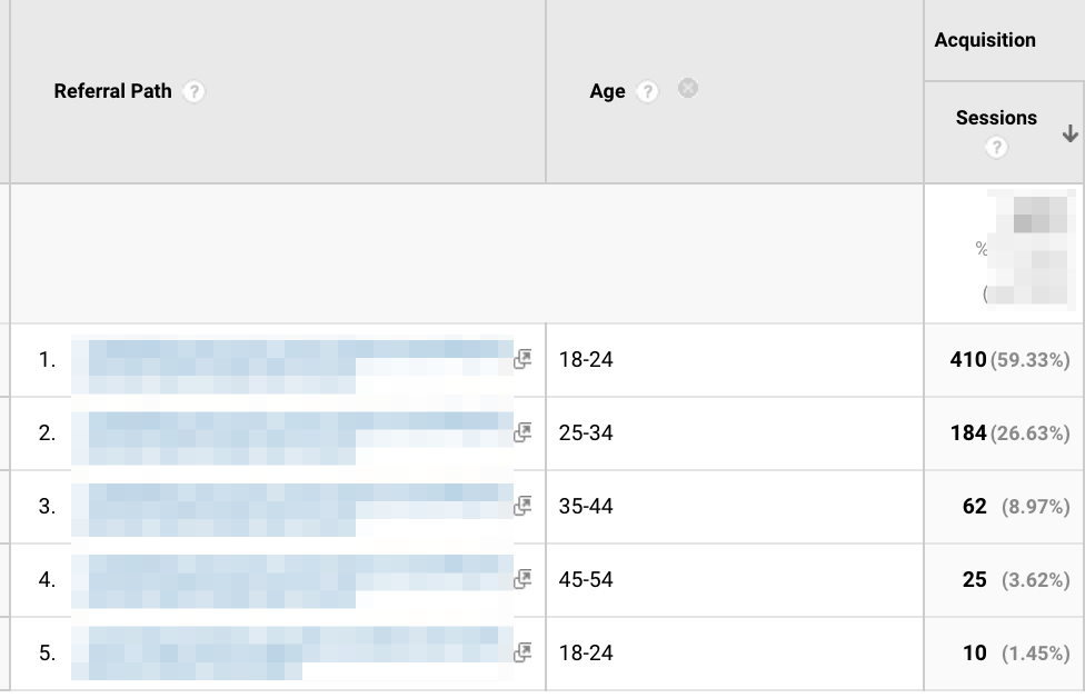
Once selected, your report will update with something that looks like the following.
Advanced filtering can be used to filter the report by either your primary dimension, secondary dimension, or both.
Secondary Dimensions can also be used with Pivot Tables, which will be covered next.
ExampleofUse
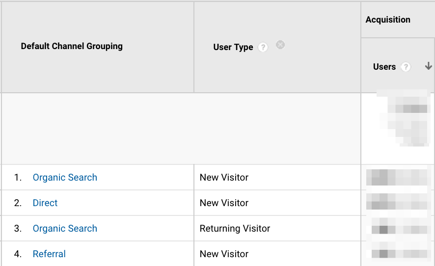
Imagine your referral traffic from Facebook has increased lately and you want to see what age range users are within to see if it matches your campaign targets.
- Navigate to Acquisition > Referrals > Select Facebook
- Click on Secondary Dimension
- Select Age
Limitations
- Limited data sometimes makes this a useless feature.
- Using custom segments, large date ranges, or very specific filters and you may run into data sampling.
- I have run into issues with the data breaking the farther I have dug down. My advice is to double check that it makes sense, and don’t rely on it to always be perfect
HiddenFeature#5:PivotTables
Purpose
Slicing data by two dimensions and rearranging into a new table with up to two metrics shown.
WhereItisFound

HowtoUse
These work similarly to Excel pivot tables (and if you have never used excel pivot tables, go learn them!). Pivot tables give you the ability to view the data by two dimensions visually in a new table format.
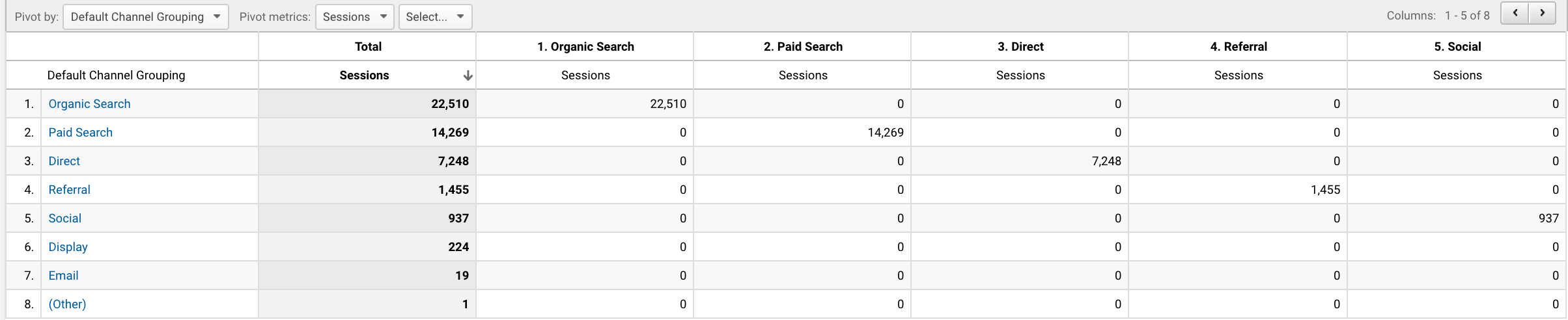
Click on the pivot table option, and it will by default be pivoting the data by the same dimension of the main report. This isn’t very useful.
To update, select a different dimension in the “Pivot By” drop down.
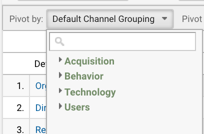
The Pivot By dimensions are limited based on what area of analytics you are in. The options under Audience are different than Acquisition. Play around to find the correct mix of dimensions to answer your question.
Next, select the metric or metrics you would like to view in the table.
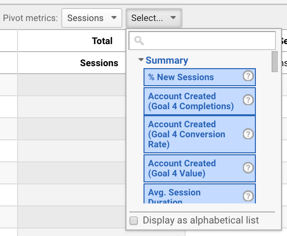
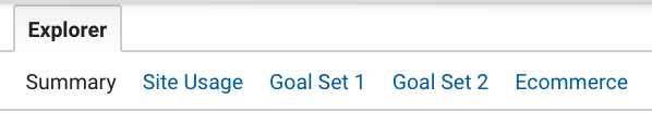
Metrics are dependent on which metric view you have selected. To change your options, select a different report in the explorer. Site Usage will change the pivot table to metrics to be Site Usage specific, and so on.
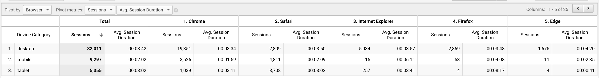
You'll end up with something that looks like this.
This Pivot Table is starting to get more useful than the starting pivot table, but it can become even more useful if you combine it with secondary dimensions, advanced filtering, or segments. In this example, I already removed campaigns (not set) through filters to remove useless data from the table.
ExampleofUse
Development is working on improvements for device types and asks for data on how users are engaging cross-device and which browsers are most relevant.
Use pivot tables to display the browsers that your users are utilizing most often on each device type, and how the site engagement varies.
- Navigate to Audience > Mobile > Overview
- Select the Pivot Table Report
- Change Pivot By to Browser
- Add a second metric for Average Session Duration
Limitations
- Limited dimensions to pivot by. Tip: You may be able to bypass some of these limitations by using secondary dimensions.
- Only two metrics are allowed.
- You cannot apply functions within the pivot table like you would in Excel.
Hopefully, these hidden features can streamline your work in Google Analytics by saving you time and helping you find the story behind the data. If there is anything missing that you absolutely love, or you have questions about these features please leave a comment below!